Work
About
Contact
Work
About
Contact
Alasdair Hall

Wonder Wayfinding

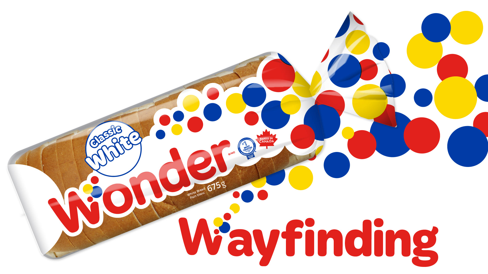
Wonder bread was having a Wayfinding problem, and I was tasked with giving the branded packaging portfolio a facelift.
Wonder Wayfinding
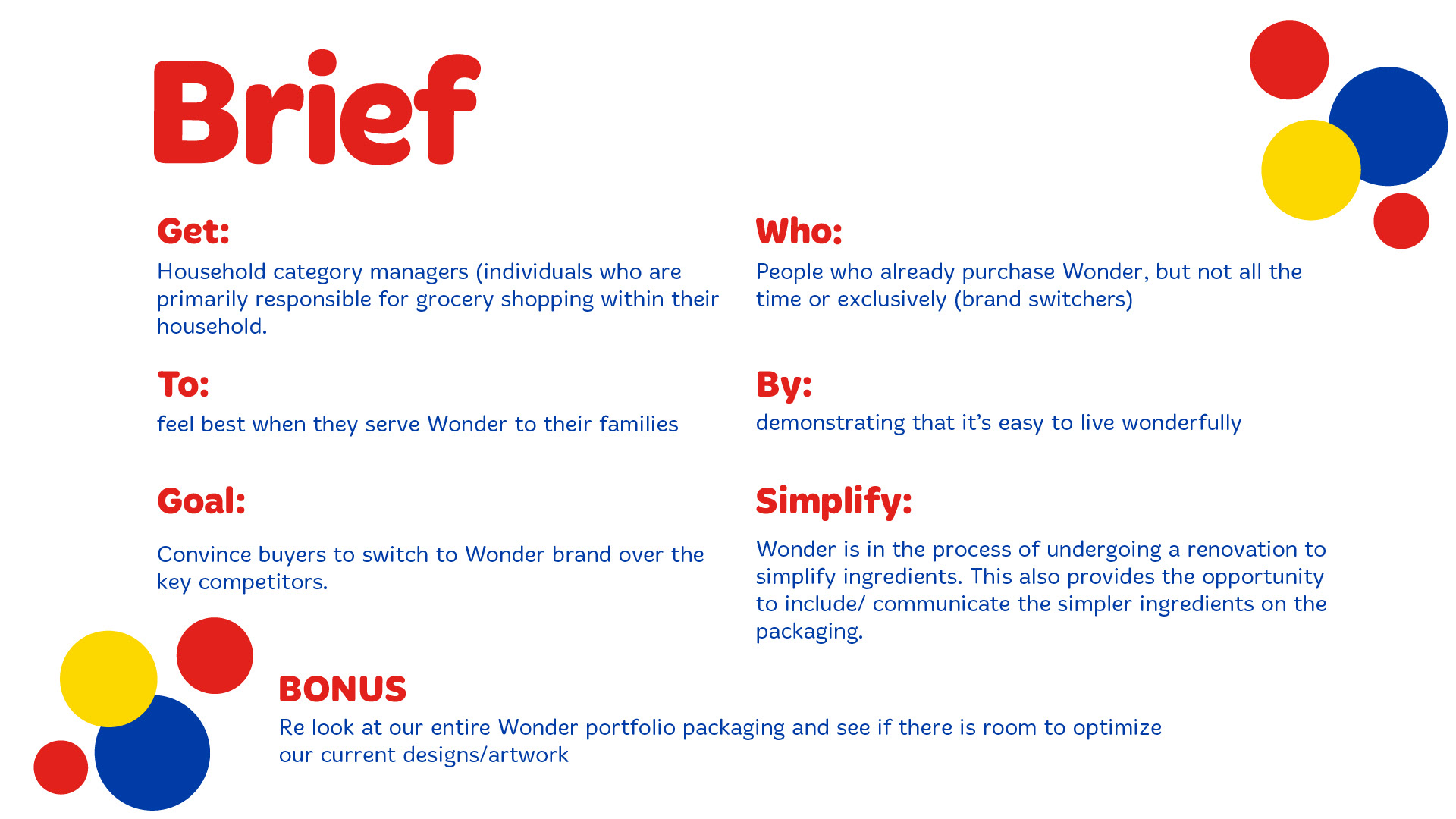
Brief Get — Who: Household category managers (individuals who are primarily responsible for grocery shopping within their household). People who already purchase Wonder, but not all the time or exclusively (brand switchers). To: Feel best when they serve Wonder to their families, demonstrating that it’s easy to live wonderfully. By: Convince buyers to switch to Wonder brand over the key competitors. Goal: Wonder is in the process of undergoing a renovation to simplify ingredients. This also provides the opportunity to include/communicate the simpler ingredients on the packaging. Bonus — Simplify: Re-look at our entire Wonder portfolio packaging and see if there is room to optimize our current designs/artwork.
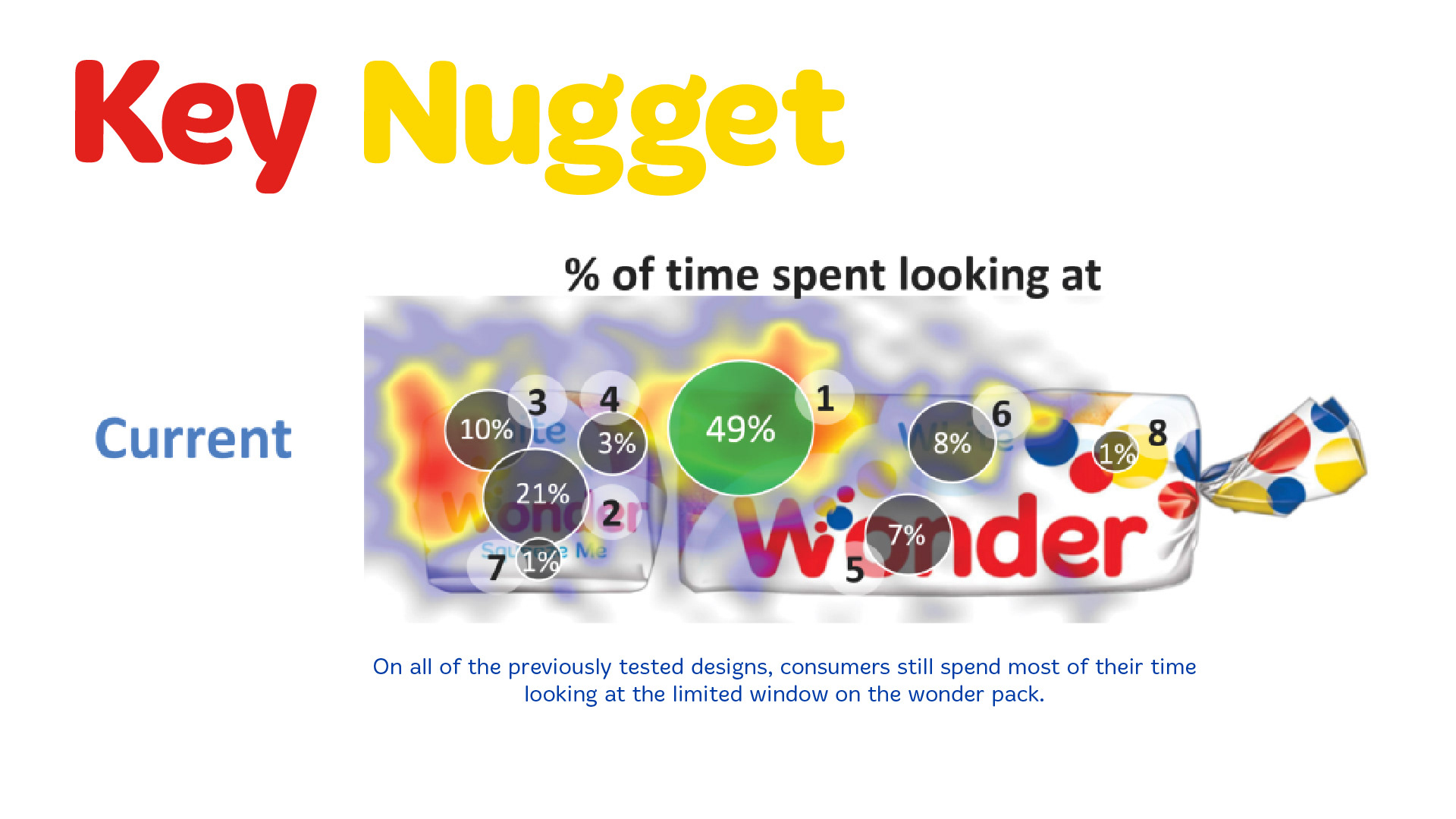
Key Nugget On all of the previously tested designs, consumers still spend most of their time looking at the limited window on the Wonder pack. Supporting consumer eye-tracking study shows that 49% of viewing time is concentrated on the visible bread/product window.
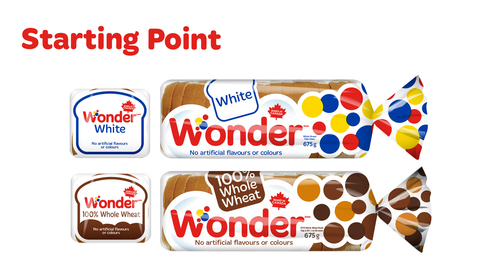
Starting Point Existing Wonder White and Wonder 100% Whole Wheat packaging shown as the starting point for the redesign. Key existing claims include: White 100% Whole Wheat Baked in Canada No artificial flavours or colours
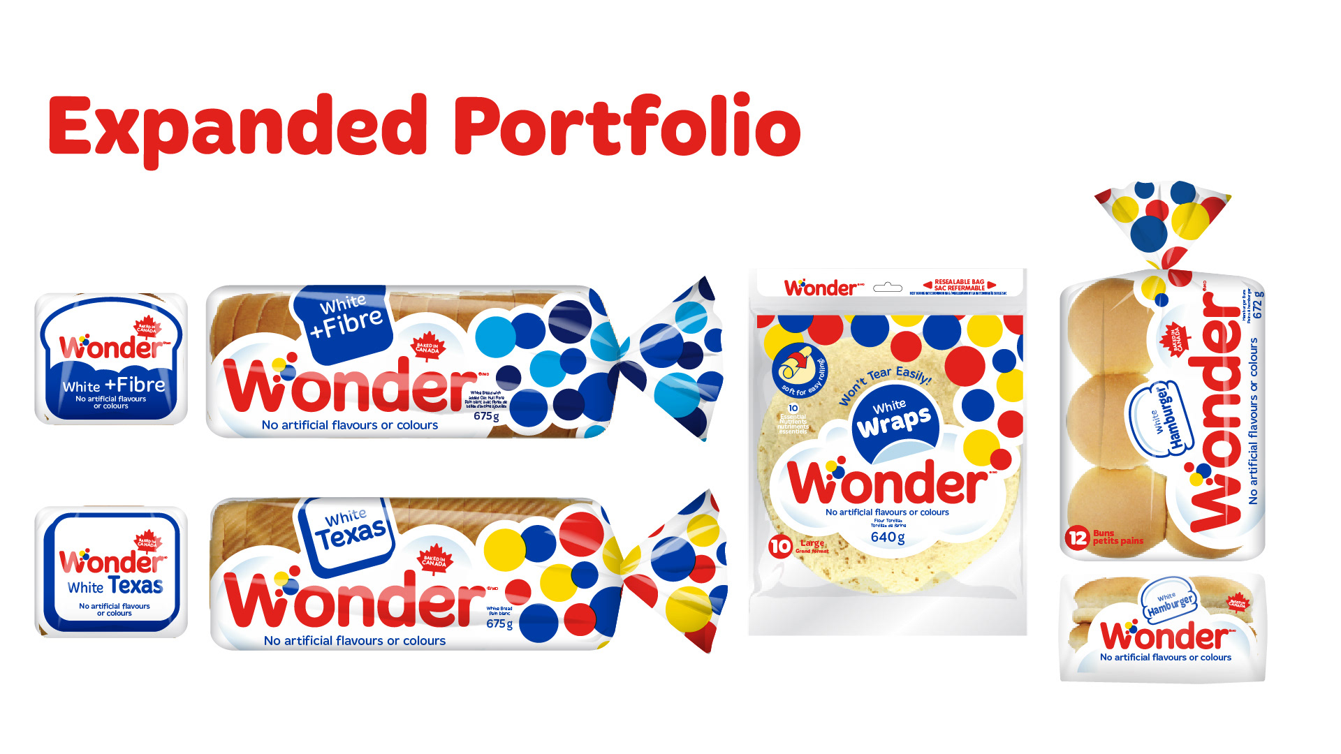
Expanded Portfolio Existing Wonder portfolio shown across multiple packaging formats and SKUs, including: White + Fibre White Texas White Wraps Hamburger White The slide demonstrates how the existing Wonder visual system translates across bread bags, wraps and buns.
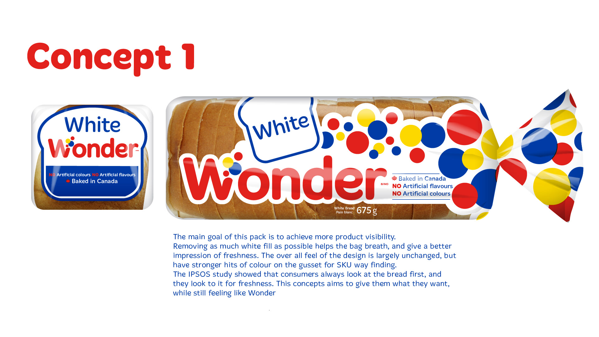
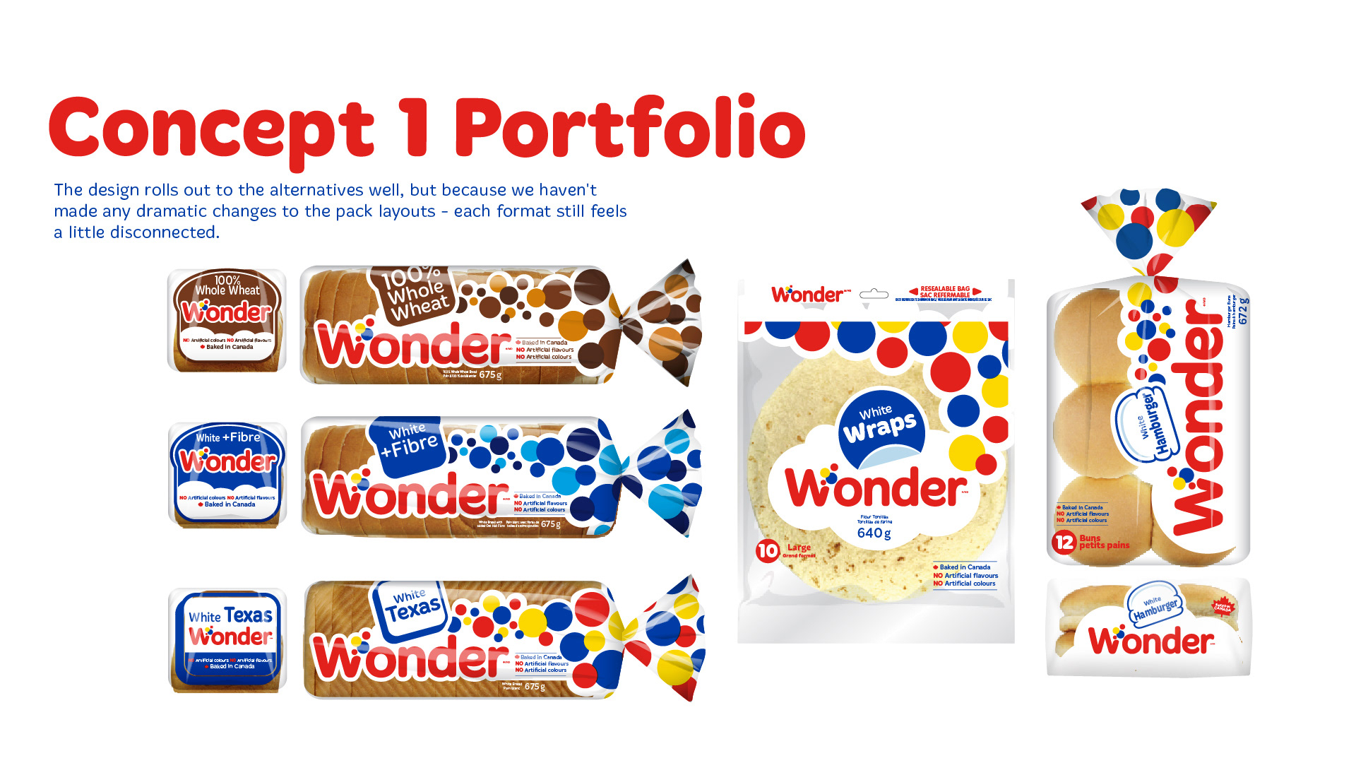
Concept 1 The main goal of this pack is to achieve more product visibility. Removing as much white fill as possible helps the bag breathe and gives a better impression of freshness. The overall feel of the design is largely unchanged, but has stronger hits of colour on the gusset for SKU wayfinding. The IPSOS study showed that consumers always look at the bread first, and they look to it for freshness. This concept aims to give them what they want, while still feeling like Wonder.
Concept 1 Portfolio The design rolls out to the alternatives well, but because we haven’t made any dramatic changes to the pack layouts, each format still feels a little disconnected. Portfolio examples include: 100% Whole Wheat White + Fibre White Texas White Wraps Hamburger White
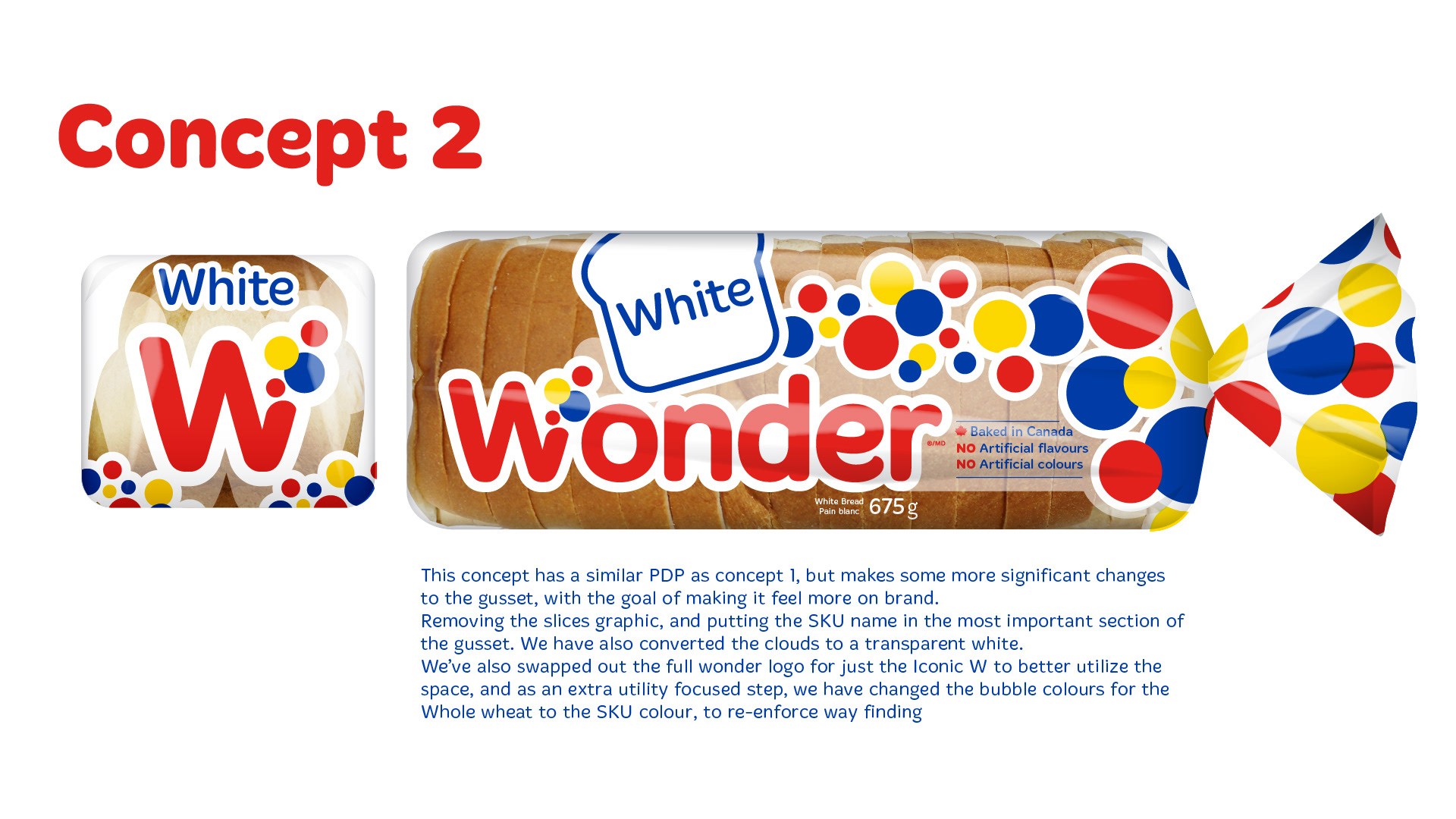
Concept 2 This concept has a similar PDP as Concept 1, but makes some more significant changes to the gusset, with the goal of making it feel more on brand. Removing the slices graphic and putting the SKU name in the most important section of the gusset. We have also converted the clouds to a transparent white. We’ve also swapped out the full Wonder logo for just the iconic W to better utilize the space, and as an extra utility-focused step, we have changed the bubble colours for the Whole Wheat to the SKU colour, to reinforce wayfinding.
Concept 2 Portfolio This concept gusset helps to unify the look of our various packs and product types. Over time the consumer will learn to look for the “W” and know that the SKU is tied to it. The PDPs of these packs are still slightly disconnected, but the brand elements help tie them together, and the transparent white helps with the product show-through. Portfolio examples include: 100% Whole Wheat White + Fibre White Texas White Wraps Hamburger White
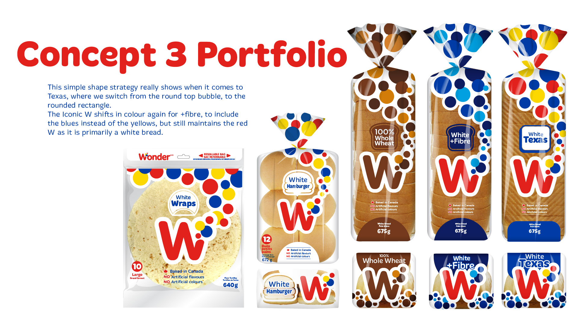
This concept is all about simplification. The claims are all connected, the logo is simplified and replicated on both the PDP and gusset, and in place of the gusset slice, we have used a simple bubble shape to represent the round-top nature of these SKUs. This gives us a nice space to fill with the SKU colour, as well as hold the SKU name in an important area of the pack. On top of that, we have also used the “W” itself to help hammer home the SKU colour, so there is no mistaking White from Whole Wheat.
Concept 3 Portfolio This simple shape strategy really shows when it comes to Texas, where we switch from the round-top bubble to the rounded rectangle. The iconic W shifts in colour again for +Fibre, to include the blues instead of the yellows, but still maintains the red W as it is primarily a white bread. Portfolio examples show the visual system applied across: 100% Whole Wheat White + Fibre White Texas White Hamburger White Wraps
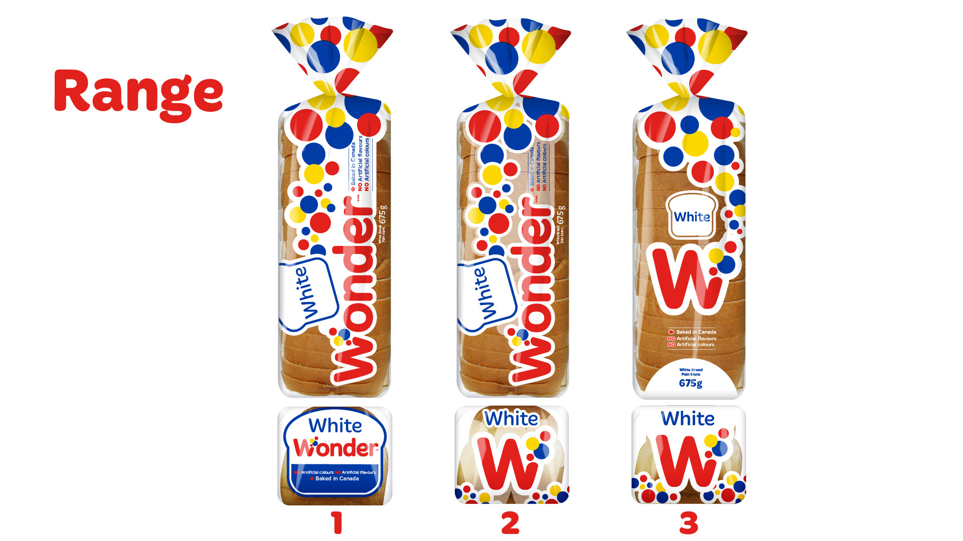
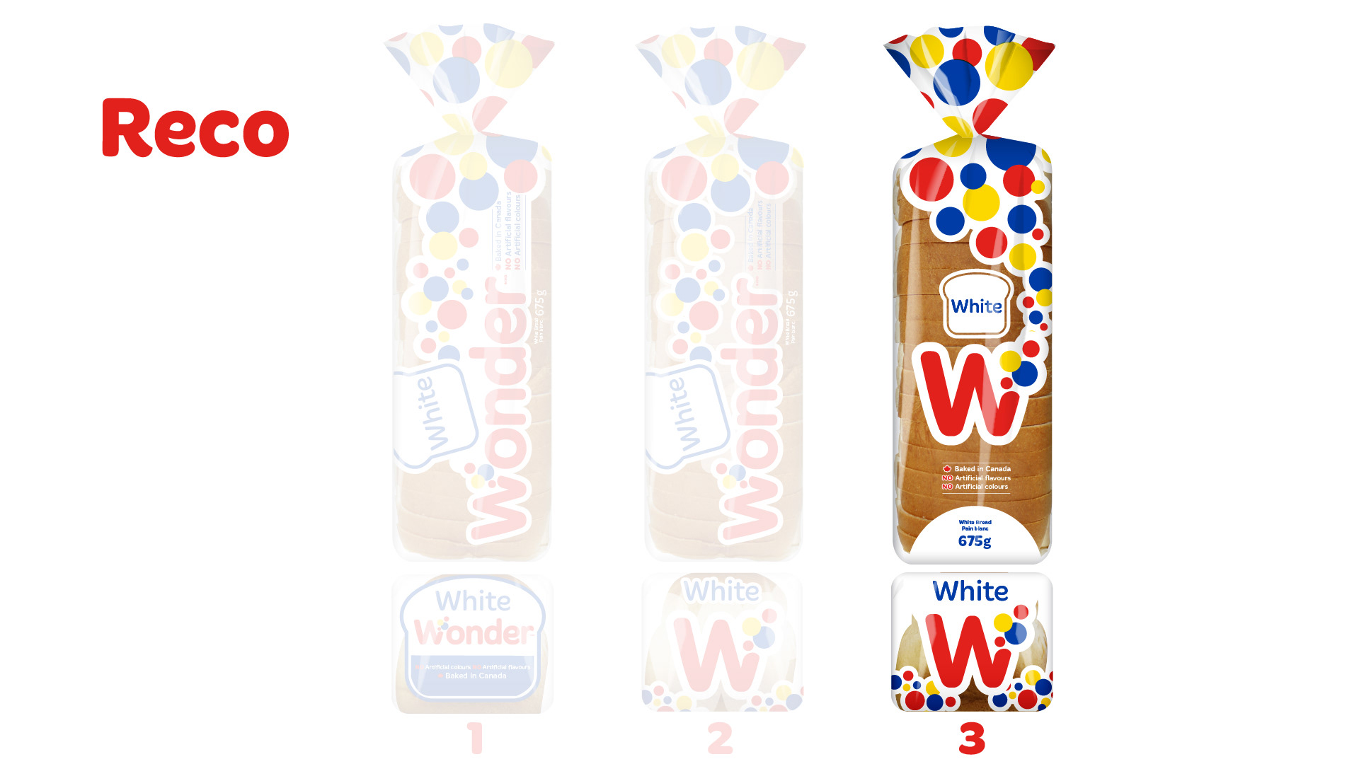
Range Side-by-side comparison of Concepts 1, 2 and 3 applied to Wonder White packaging. 1 — Concept 1: Evolution of the existing Wonder identity with increased product visibility. 2 — Concept 2: Greater emphasis on the iconic Wonder W and unified gusset. 3 — Concept 3: Simplified packaging architecture built around the Wonder W, product visibility and SKU colour.
Concept 3 selected as the recommended direction from the three proposed packaging systems
SKU Colour Exploration When we think about SKU colours and what they mean for bread, we have a few limiting factors. These are mostly determined by common practices by competitors, and to some extent human nature. Colour territories explored include: Inclusions / Berry flavours Healthy / Herbs / Nature Sesame Whole Wheat The slide uses a colour guide to investigate potential colour families for distinguishing Wonder SKUs
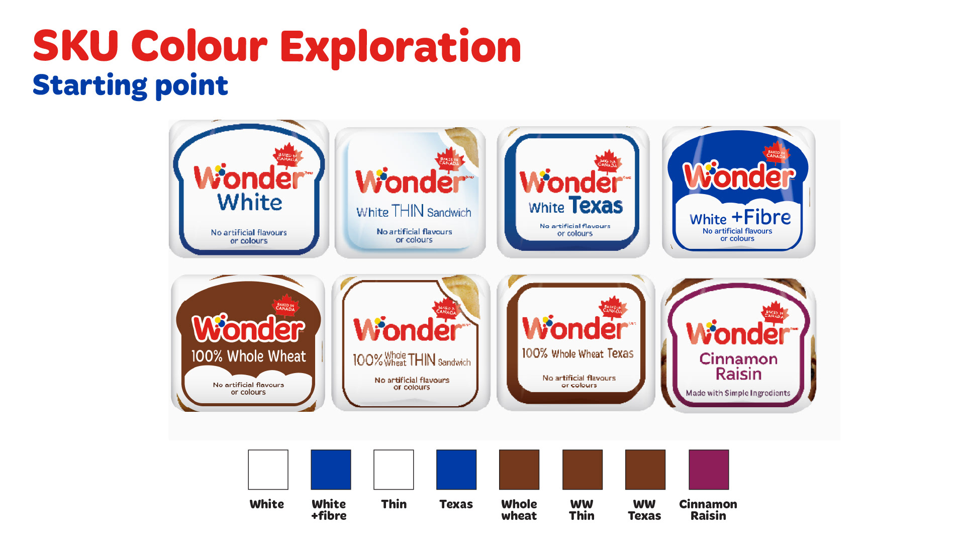
SKU Colour Exploration Starting point Existing SKU colour architecture: White — White Blue — White + Fibre White — Thin Blue — Texas Brown — Whole Wheat Brown — Whole Wheat Thin Brown — Whole Wheat Texas Purple — Cinnamon Raisin
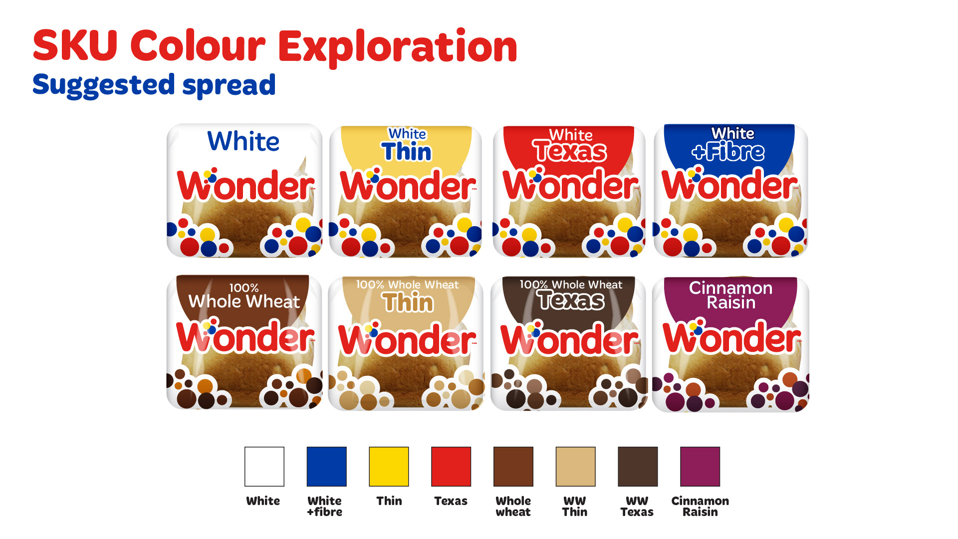
SKU Colour Exploration Suggested spread Proposed colour-coded portfolio: White — White Yellow — White Thin Red — White Texas Blue — White + Fibre Brown — 100% Whole Wheat Tan — 100% Whole Wheat Thin Dark Brown — 100% Whole Wheat Texas Purple — Cinnamon Raisin The proposed system creates stronger visual differentiation between individual Wonder SKUs while maintaining a consistent packaging architecture.
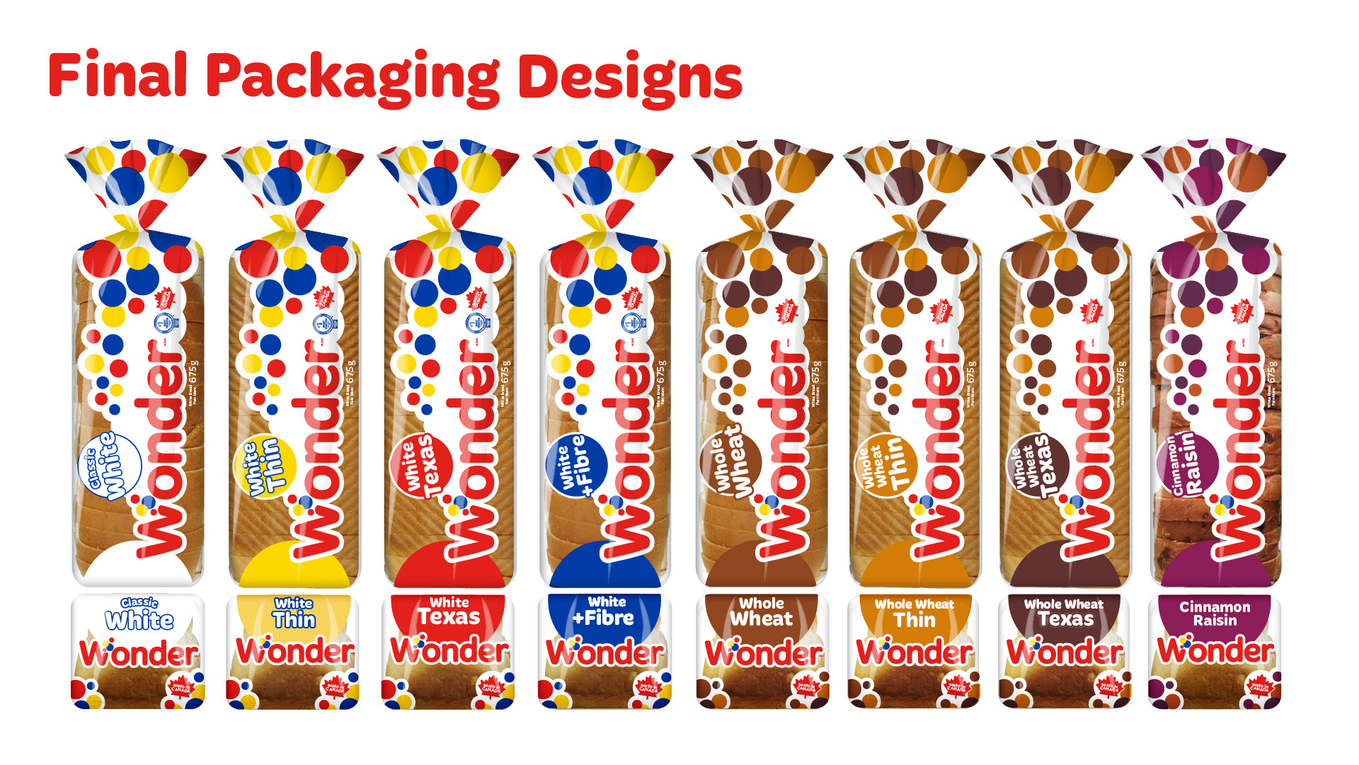
Final Packaging Designs Final Wonder packaging system shown across eight SKUs: White White Thin White Texas White + Fibre 100% Whole Wheat 100% Whole Wheat Thin 100% Whole Wheat Texas Cinnamon Raisin The final system uses consistent Wonder branding and bubble graphics while assigning distinct colours to individual SKUs for improved portfolio wayfinding.

You may also like

Signage
2018
Holiday Corrugate Displays
2018
Design Pitch Process - Save on Foods
2019
Baked In Store - Packaging Production Art
2019
Bold and Vibrant Tortilla Flavors for Casa Mendosa
2023
Cafe Re-Brand
2018
Emailers
2018
Food Photography
2018
Universal Partnership / Wonder, D'Italiano, Gadoua
2019
Strategic Design Pillars: Shared Creative Vocabulary
2023
↑Back to Top
Powered by Adobe Portfolio