Work
About
Contact
Work
About
Contact
Alasdair Hall

Wonder X Jays Ballpark Classics

Packaging Redesign for the Wonder Ballpark Classic Burger and Hot dog buns, with a focus on the renewed partnership with the Toronto Bluejays.

Wonder Ballpark Classics — Packaging Redesign  Introduction to the Wonder Ballpark Classics packaging redesign, developed to celebrate Wonder's partnership with the Toronto Blue Jays.  The slide features a close-up of the proposed packaging identity, combining the recognizable red Wonder logo with baseball-inspired typography, Toronto Blue Jays branding and a bold blue-and-white diamond-shaped graphic.  A blue plaid pattern frames the design, while the Blue Jays logo anchors the bottom of the composition. Two sesame seed hamburger buns remain visible behind the central graphic.  The identity emphasizes Wonder's designation as the "Official Bun of the Toronto Blue Jays," balancing the recognizable Wonder brand with the visual language of professional baseball.
The Brief  The objective was to redesign Wonder Ballpark Classics' limited-time packaging to generate excitement among customers and strengthen the brand's association with the Toronto Blue Jays.  The creative direction called for a more elevated visual identity than the existing Ballpark packaging, with a stronger emphasis on the Blue Jays' distinctive colours, graphics and baseball heritage.  The designs needed to be bright, bold and energetic while adhering to the Toronto Blue Jays' restrictive brand guidelines, particularly the requirement to clearly communicate the relationship as an official partnership rather than team ownership.  The slide showcases the existing Wonder Ballpark Classics hamburger bun packaging, featuring baseball graphics, colourful Wonder bubbles and Toronto Blue Jays branding.  A supporting diagram illustrates the Blue Jays' logo usage and required clear space, highlighting the design constraints that informed the creative exploration.
The Discovery  An exploration of existing Toronto Blue Jays partnership packaging revealed that most third-party brands maintain a strong presence of their own visual identities rather than fully adopting the team's branding.  Products that lean more heavily into the Blue Jays' visual identity tend to feature minimal competing brand presence or are directly associated with the team.  This presented an opportunity to build upon the recognizable elements of Wonder's existing packaging system while amplifying the baseball-inspired graphics to create stronger differentiation for the limited-time Ballpark range.  Another important observation was the natural overlap between Wonder's and the Toronto Blue Jays' brand colours. By reducing the prominence of yellow and emphasizing red, white and blue, the packaging could create a stronger visual connection between the two brands.  The slide presents a collection of existing Blue Jays partnership products, including food packaging, promotional merchandise, household products and branded accessories.  These competitive references establish the visual landscape and inform the creative strategy for the redesign.
C1 — Evolution of the Classic Ballpark Identity  The first concept explores an evolution of the existing Wonder Ballpark Classics packaging, emphasizing clean simplicity, recognizable branding and a stronger connection to the Toronto Blue Jays.  The Wonder logo remains large and prominent, while the surrounding packaging adopts a distinctly baseball-inspired aesthetic.  A bold diamond-shaped graphic references the geometry of a baseball field, incorporating blue plaid textures, athletic-style typography and the Toronto Blue Jays logo.  The packaging is differentiated by product type, with blue accents identifying hamburger buns and red accents identifying hot dog buns.  The slide presents both front-facing and alternate packaging views for the two SKUs, including the patterned bag closures and the transparent areas that showcase the buns.  The overall design maintains Wonder's brand recognition while giving the Toronto Blue Jays partnership a significantly stronger presence.
C2 — A More Playful Partnership Identity  The second concept introduces a more contemporary visual direction, combining the recognizable elements of Wonder with a simplified, energetic baseball-inspired design.  The layout features a large angular colour block, creating a clear visual hierarchy for the Wonder logo, Ballpark Classics branding and Toronto Blue Jays partnership.  Colourful circular graphics inspired by Wonder's signature bubbles are incorporated throughout the packaging, alongside baseball illustrations and bright primary colours.  By reducing the number of competing textures and decorative elements, the concept creates a cleaner, more legible design while maintaining a playful visual personality.  Blue identifies the hamburger buns, while red identifies the hot dog buns, providing immediate SKU differentiation.  The slide presents full packaging mockups and alternate views for both products, demonstrating how the visual system works across the Ballpark Classics range.  This concept emphasizes the partnership by blending both brands' recognizable visual elements into a cohesive packaging identity.
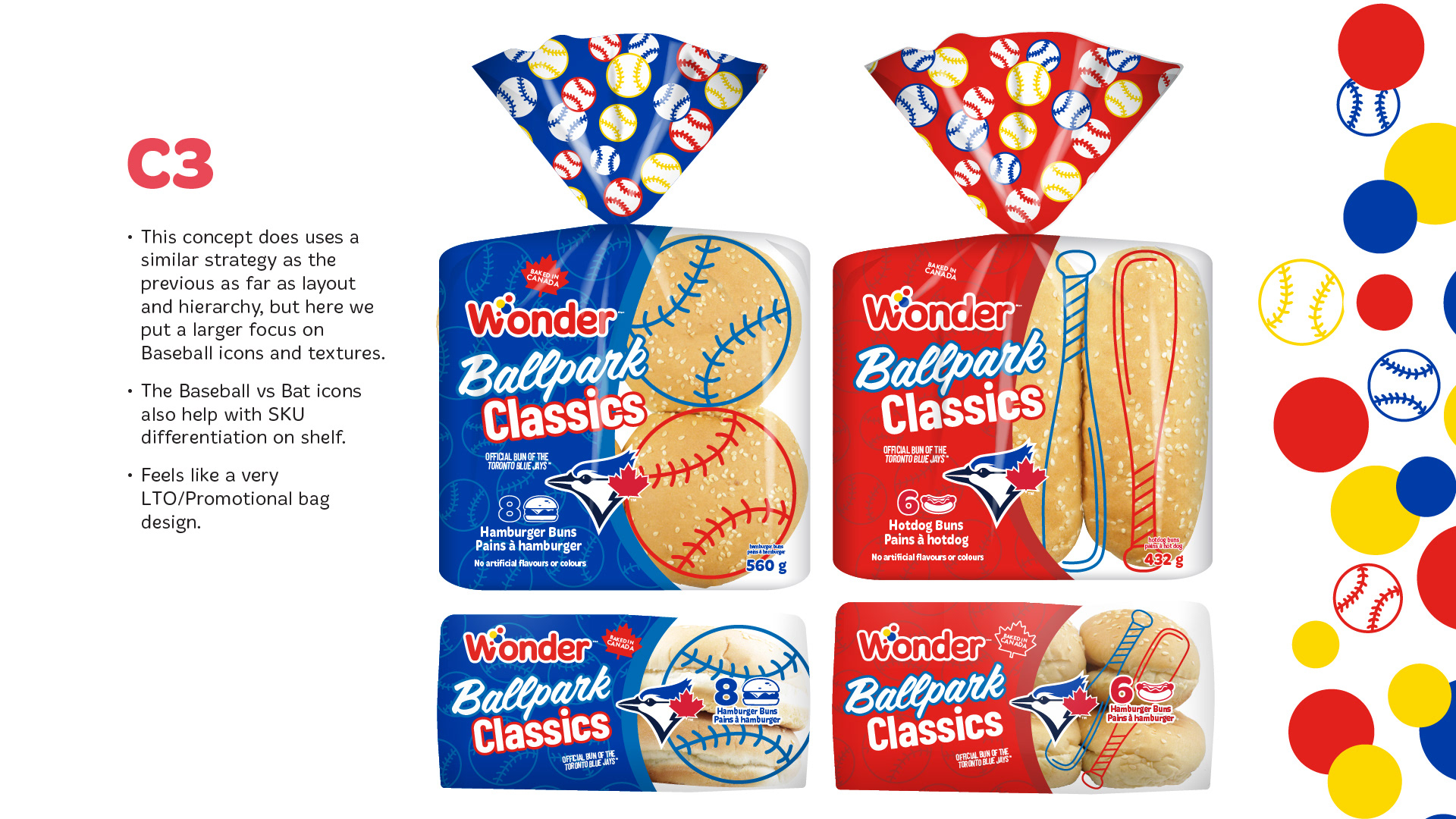
C3 — Baseball-Inspired Promotional Packaging  The third concept builds upon the layout and visual hierarchy established in Concept 2, placing a greater emphasis on baseball imagery and sporting textures.  The design incorporates oversized baseball and bat illustrations that extend across the transparent product windows, creating a dynamic interaction between the graphics and the buns inside the packaging.  Hamburger buns are identified by large baseball illustrations, while hot dog buns feature elongated baseball bat graphics.  This visual distinction reinforces SKU wayfinding while adding a playful, sports-focused personality to the packaging.  The Wonder logo, Ballpark Classics typography and Toronto Blue Jays branding remain prominent, supported by bold red-and-blue colour blocking.  The slide presents both product varieties in full packaging mockups and alternate views, demonstrating how the baseball graphics adapt across the range.  Of the three directions, this concept has the strongest limited-time promotional character, emphasizing excitement and baseball culture.
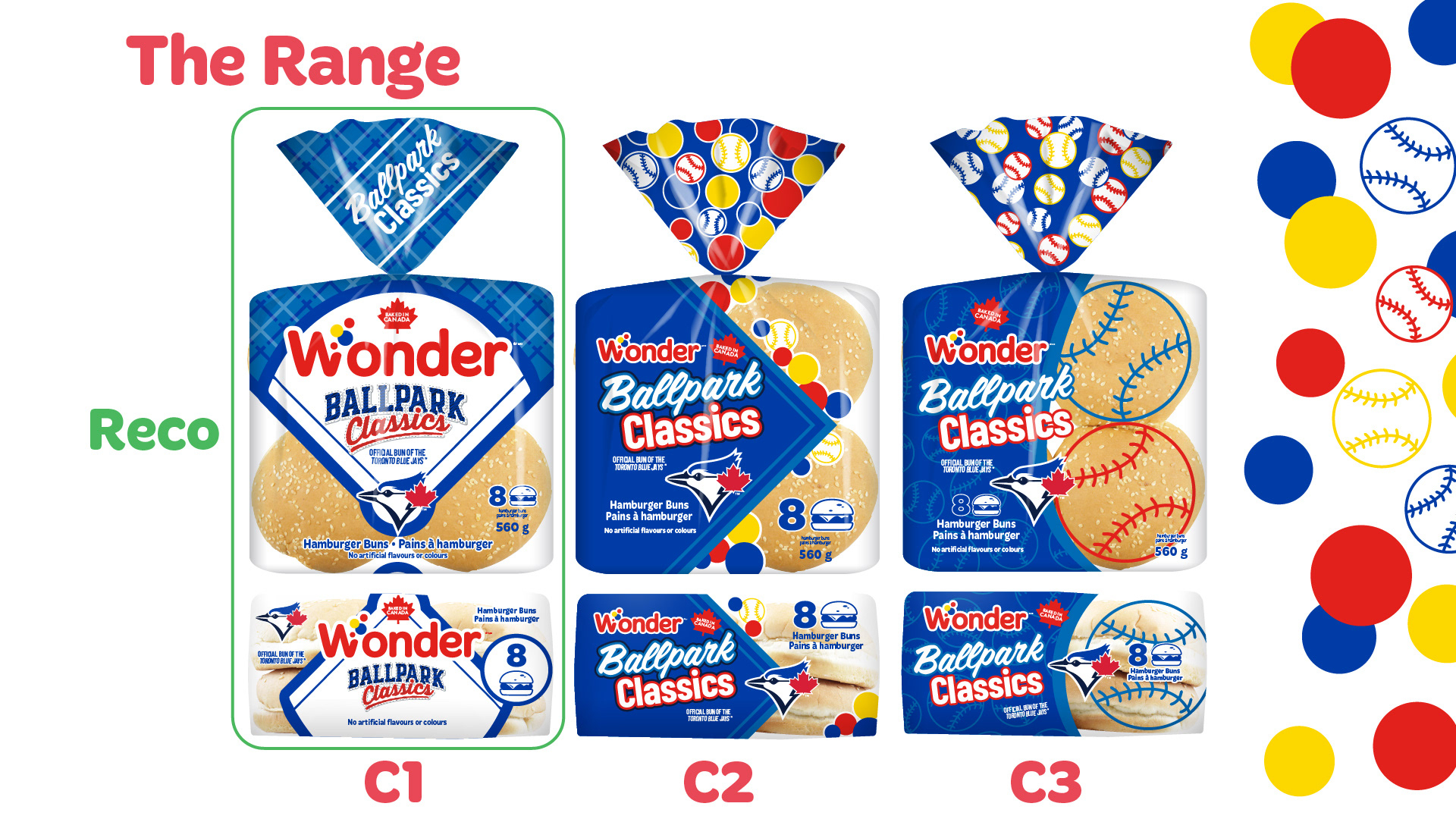
The Range — Concept Comparison and Recommendation  Following the initial creative exploration, all three packaging concepts were presented side by side to evaluate their visual impact, brand recognition and effectiveness as a cohesive product range.  Concept 1 retains the strongest connection to the existing Wonder Ballpark identity, incorporating a large baseball diamond graphic, blue plaid textures and prominent Toronto Blue Jays branding.  Concept 2 introduces a more playful partnership aesthetic, combining Wonder's colourful bubbles with simplified angular graphics.  Concept 3 places the greatest emphasis on baseball imagery, using oversized sporting equipment illustrations to distinguish individual SKUs.  The slide presents the hamburger bun packaging for each concept, including front-facing and alternate views.  Concept 1 is highlighted as the recommended direction, identified by a green outline and recommendation label.  The recommendation prioritizes a recognizable Wonder identity, a strong Toronto Blue Jays partnership presence and a clean, cohesive packaging system.
Revised Version — Final Concept Refinements  Following the selection of Concept 1, the packaging underwent further refinements to strengthen SKU differentiation and improve consumer wayfinding.  The most significant adjustment was the introduction of stronger colour blocking within the central diamond-shaped graphic.  The hamburger bun packaging features a predominantly blue diamond, while the hot dog bun packaging uses a bold red diamond. This creates an immediate visual distinction between the two products while maintaining a consistent overall design.  The revised artwork retains the blue plaid bag closures, large Wonder logo, Ballpark Classics typography and Toronto Blue Jays branding.  The packaging shown also incorporates a Toronto Blue Jays 50 Seasons anniversary graphic and updated partnership marks.  The slide presents both hamburger and hot dog bun packaging in front-facing and alternate views, demonstrating the refined visual system across the range.  The result is a more clearly differentiated packaging family that preserves the visual impact of the original recommended concept.

You may also like

Mie et Cie Brand Creation
2026
Strategic Design Pillars: Shared Creative Vocabulary
2023
Emailers
2018
Universal Partnership / Wonder, D'Italiano, Gadoua
2019
Food Photography
2018
Indulgent Pies Packaging Design
2023
Wonder Wayfinding
2026
Bold and Vibrant Tortilla Flavors for Casa Mendosa
2023
MLSE Out of Home Creative
2019
Weston Foods NRA Booth
2018
↑Back to Top
Powered by Adobe Portfolio