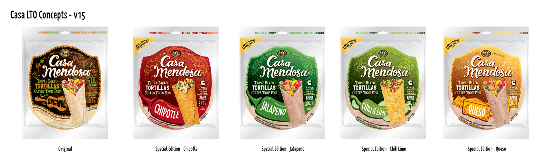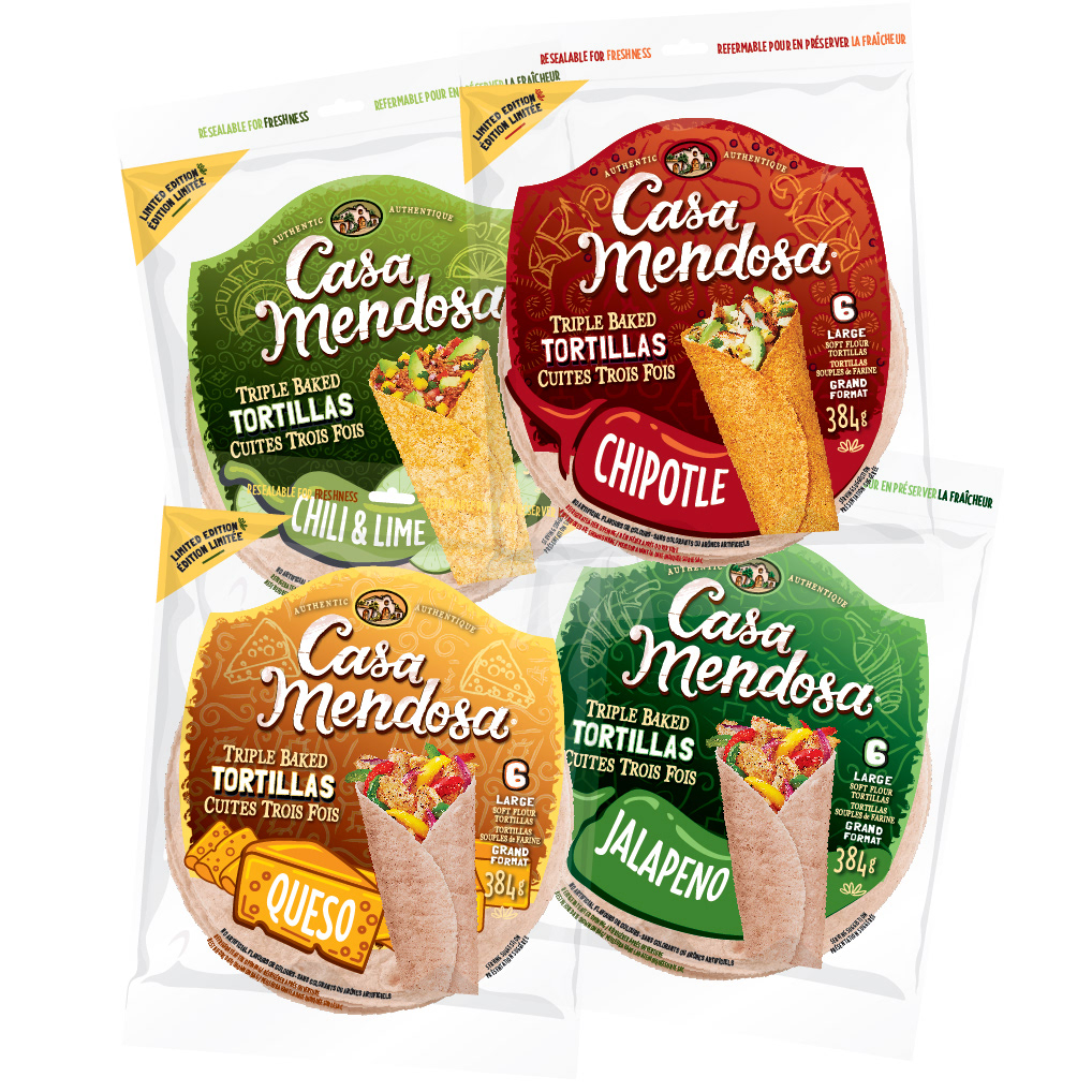
I'm excited to share my latest packaging design project for Casa Mendosa, a brand that's all about authentic and bold Mexican flavors. The creative brief for this project was to create a new line of limited edition Casa Mendosa Tortilla flavors that would fit seamlessly within their current product line, while also standing out as a premium offering.
The flavors of these tortillas were bold and vibrant, so I knew I had to create a packaging design that matched their energy. I took inspiration from traditional Mexican patterns and colors, incorporating them into the design in a way that felt modern and fresh. I also made sure to keep the brand's established look and feel, incorporating their logo and brand elements in a way that felt cohesive with the new limited edition line.
One of the biggest challenges of this project was creating packaging that felt different and more premium than the regular Casa Mendosa products, without relying on traditional premium finishes such as foil stamping or embossing. Instead, I opted for a more intricate and stylized design that would catch the eye and feel unique on the shelves. By incorporating bold patterns, vibrant colors, and playful typography, I was able to create a design that was both attention-grabbing and in line with Casa Mendosa's brand identity. The end result is a packaging design that feels fresh, modern, and sure to stand out on any store shelf.
I'm really proud of how this project turned out, and I think the packaging design perfectly captures the bold and authentic spirit of Casa Mendosa. If you're a fan of bold flavors and eye-catching design, these limited edition tortillas are a must-try!