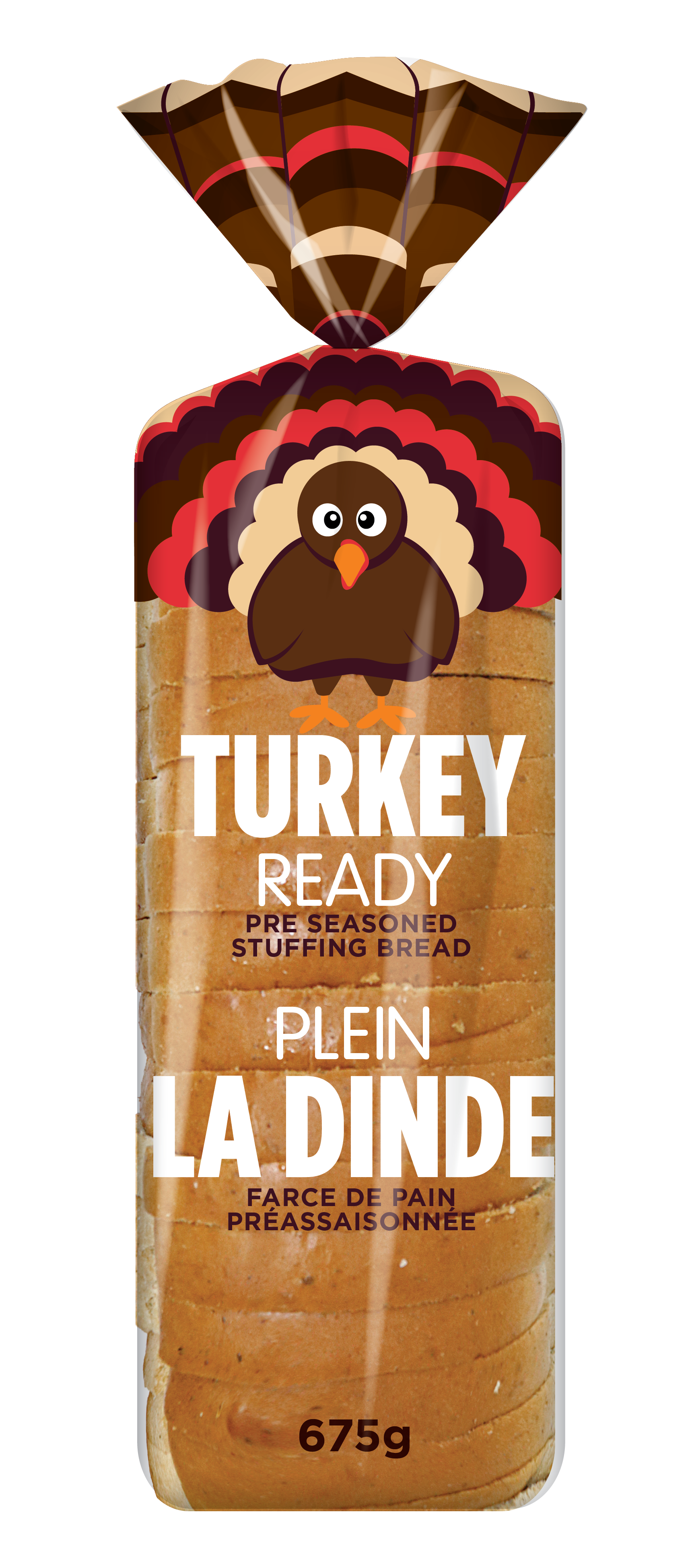
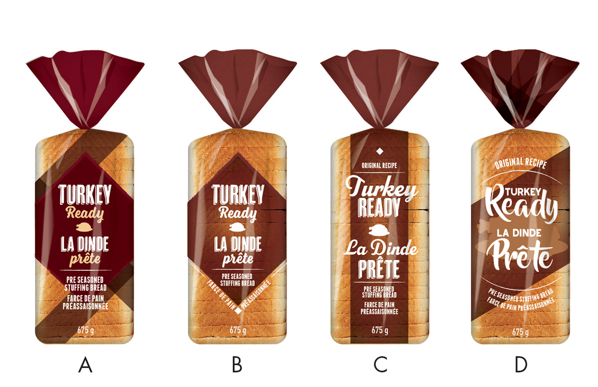
I was tasked with updating the design for 'turkey time' a very old and outdated packaging design for a pre-seasoned stuffing bread. The name rights for "turkey time" were expiring, and the team wanted to seize the opportunity to re-work the pack design.
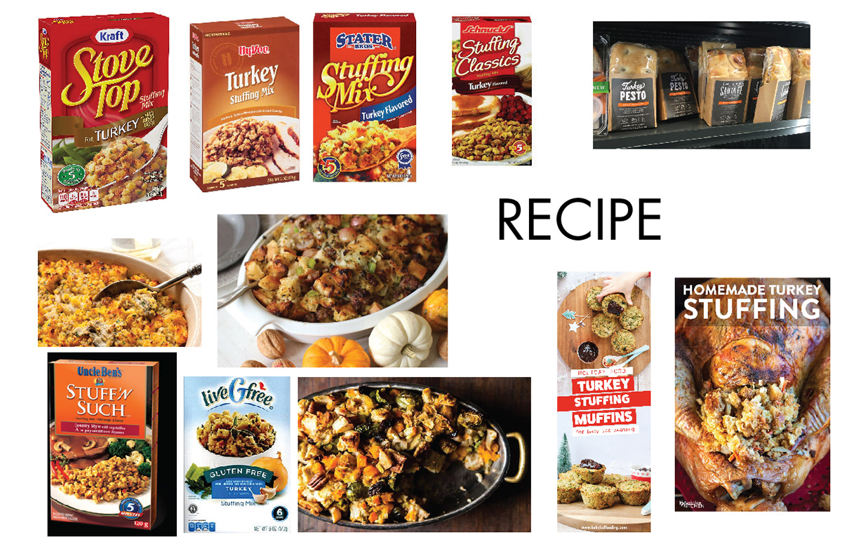
With my initial mood-boards I was exploring three potential territories that were outlined in the design brief. Recipe focused, traditional, and comedic.
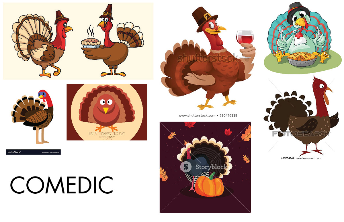
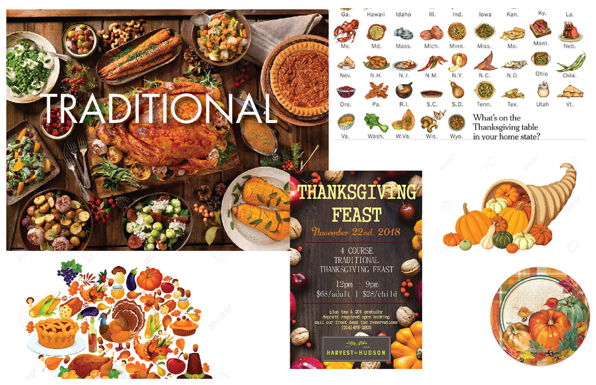
After touching base with the team, we had decided that traditional was a good option, but we were actually really passionate about the comedic. So we created concepts for both.
We also held some brainstorming sessions to determine our best naming options. we settled on "Turkey Ready" to try and stay as literal as easy to understand for the consumer as possible.
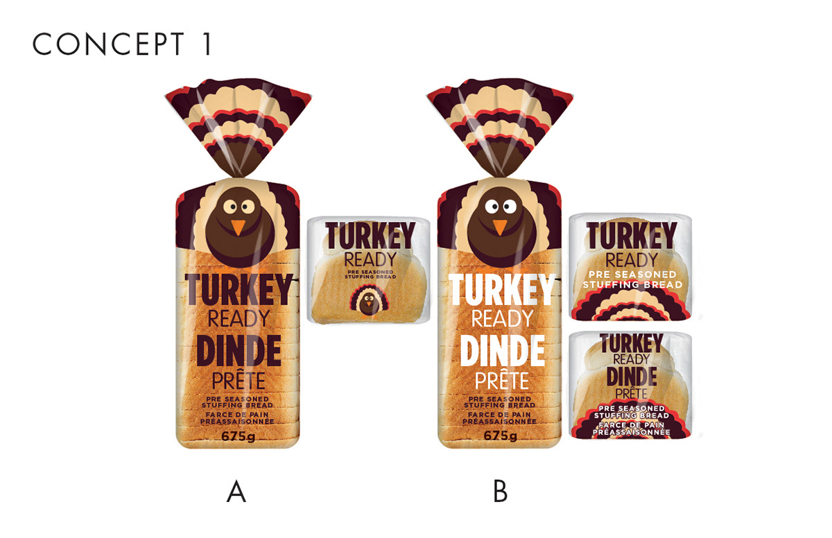
The team and myself both fell in love with Concept 1. Between the cute and engaging turkey illustration, and the pony tail representing the actual tail of the turkey. We felt that there was a lot to love about this design. We couldn't wait to make it a reality.