Work
About
Contact
Work
About
Contact
Alasdair Hall

The Rotation Room Brand Identity

The Rotation Room brand identity project, featuring the visual identity developed for a Canadian off-ice figure skating training facility.

The Rotation Room — Brand Identity Introduction to The Rotation Room brand identity project, featuring the visual identity developed for a Canadian off-ice figure skating training facility.
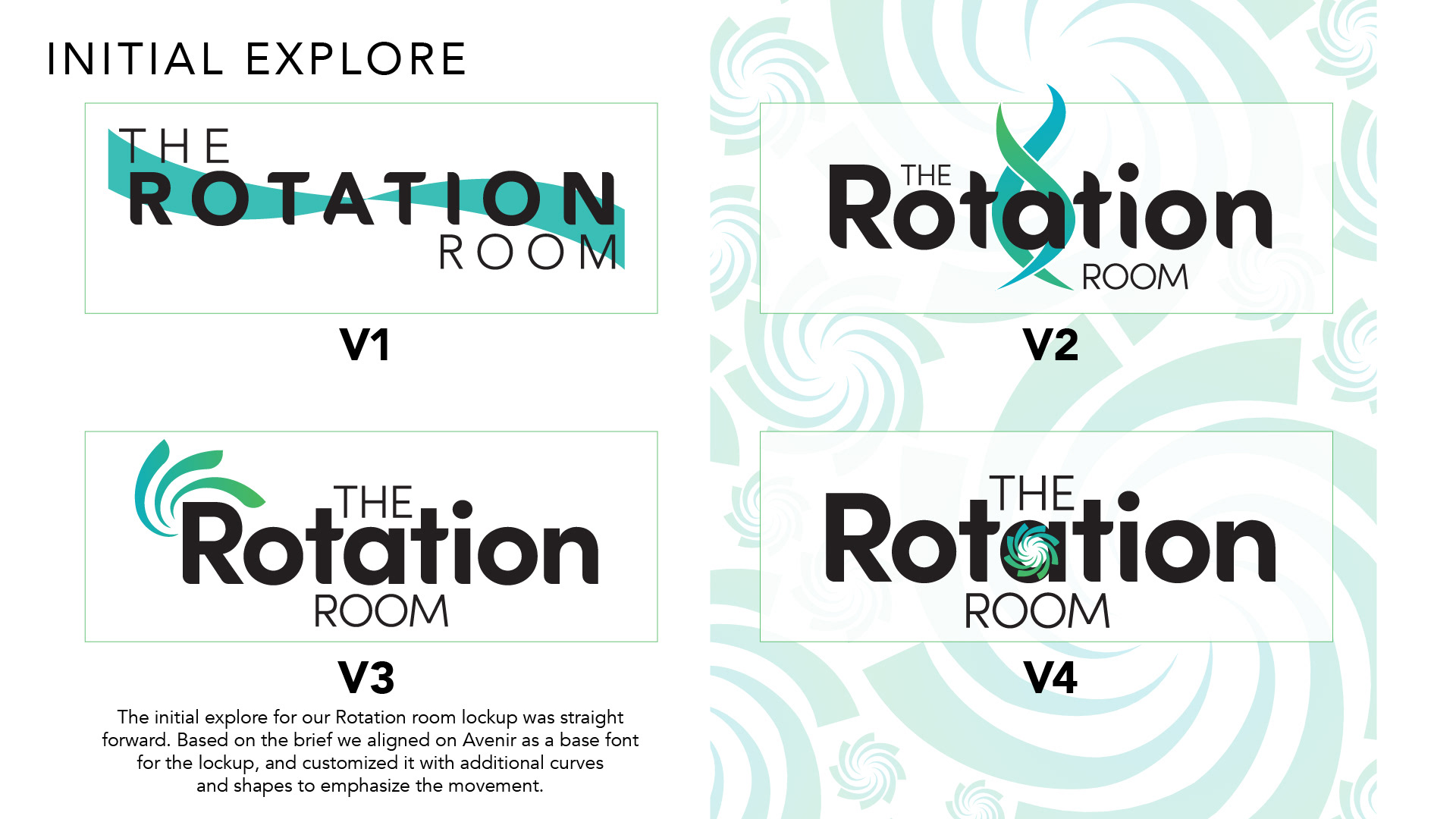
The Brief Create a new brand identity for a newly launching Canadian business called The Rotation Room. The Rotation Room is an off-ice training facility for figure skaters, featuring harness and rotating spinner technology. Inspired by similar facilities in Korea, The Rotation Room aims to become Canada's premier off-ice training destination for figure skaters. The identity should be sleek, sophisticated and minimal in design, while remaining child-friendly and playful. Figure skating has traditionally embraced a dated visual aesthetic, presenting an opportunity to stand out through a cleaner, more contemporary approach. The slide features supplied design inspiration alongside photography of a figure skater practicing at an off-ice training facility.
Initial Explore The initial exploration for The Rotation Room logo was straightforward. Based on the brief, Avenir was selected as the foundation for the typography, with customized curves and shapes introduced to emphasize movement. Four initial logo variations, labelled V1 through V4, explore different typographic treatments and approaches to incorporating rotation into the brand identity.
Final Assets The refinements were simple. The initial direction was working, but there was an opportunity to simplify the identity further and incorporate the graphic element more directly. For the colour palette, a signature gradient transitioning from bright blue to bright green was selected as the primary brand colour. The final identity includes the customized Rotation Room logo lockup and a standalone spiral graphic inspired by rotational movement. The spiral serves as a recognizable brand asset that can be applied independently or incorporated into larger compositions. The primary colour palette uses Pantone 312 and Pantone 360.
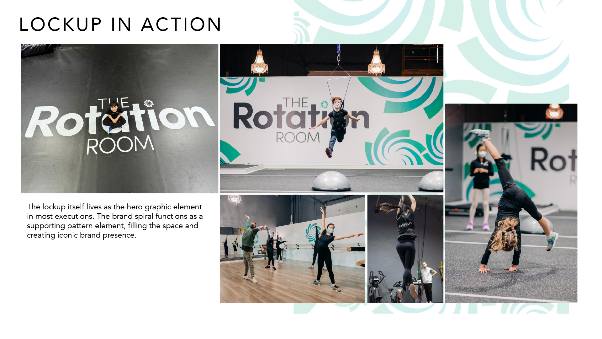
Lockup in Action The logo lockup serves as the primary graphic element across most brand applications. The spiral functions as a supporting pattern, filling available space and creating a recognizable brand presence. A collection of photographs demonstrates the identity applied throughout The Rotation Room's training facility, including large-scale wall graphics, branded training spaces and athletes practicing figure skating movements. The oversized typography and cropped blue-green spiral graphics create a strong visual presence while maintaining the clean, minimal aesthetic established in the brief.
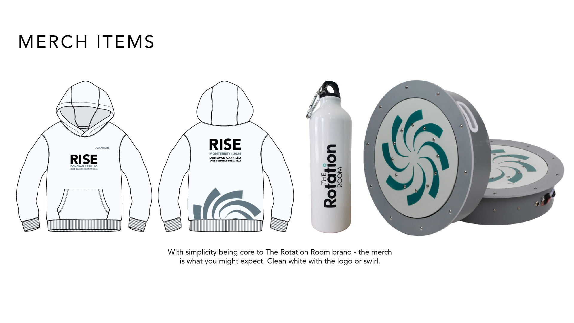
Merch Items With simplicity at the core of The Rotation Room brand, the merchandise follows the same minimal design philosophy: clean white surfaces featuring the logo or signature spiral graphic. The slide presents branded merchandise concepts, including a white hoodie with event typography and spiral graphics, a reusable water bottle featuring the vertical Rotation Room logo, and circular training equipment incorporating the spiral identity. These applications demonstrate the flexibility of the visual system across apparel, accessories and specialized training equipment.
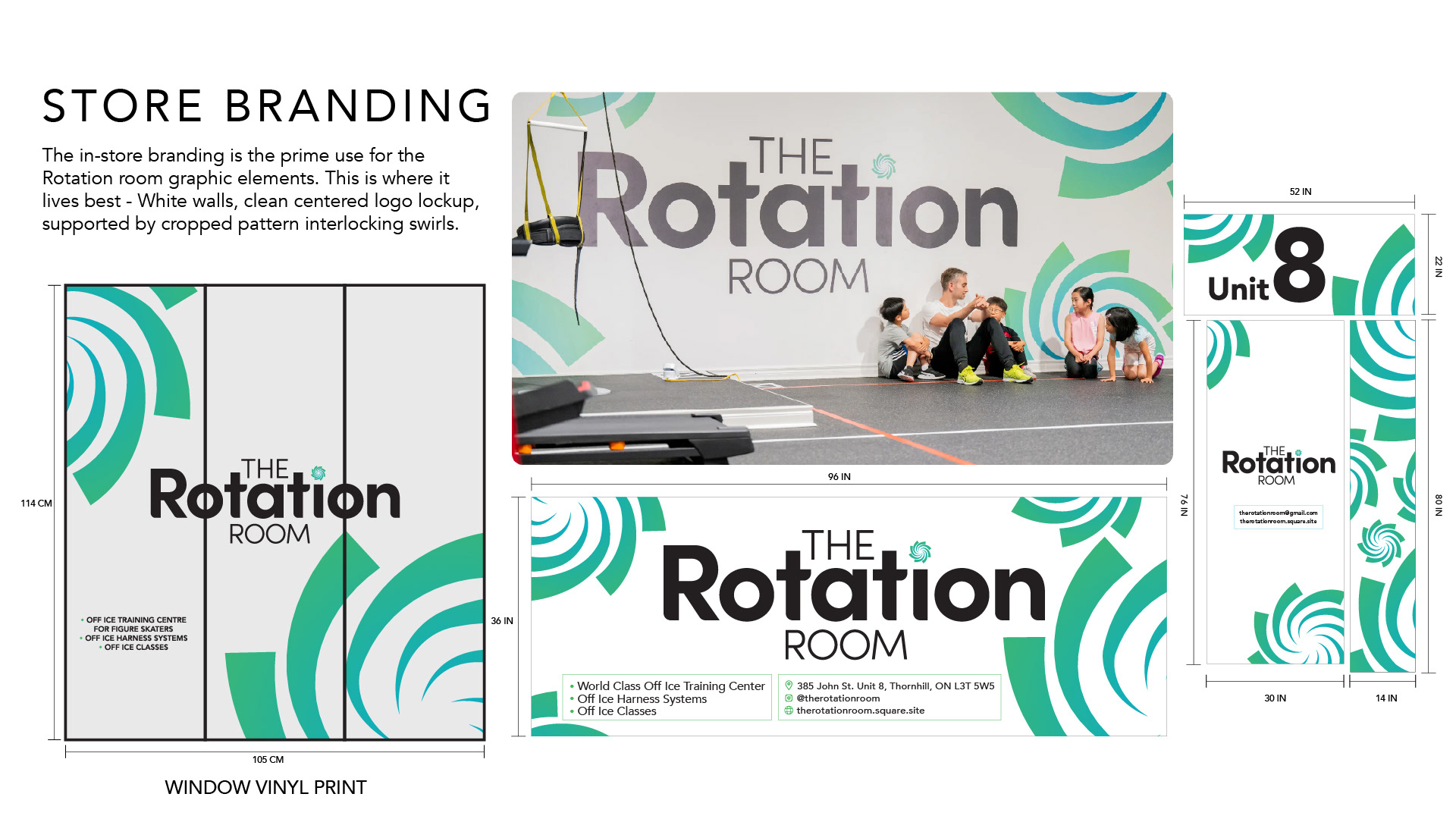
Store Branding The physical training facility is the primary environment for The Rotation Room's visual identity. White walls provide a clean foundation for the centrally positioned logo lockup, supported by large, cropped and interlocking spiral graphics. The slide presents a combination of installed interior branding photography and production concepts for window vinyl, exterior signage and facility identification. The window graphics incorporate the brand identity alongside information about the facility's services, including world-class off-ice training, harness systems and off-ice classes. The result is a consistent visual environment that reinforces the brand through large-scale applications of its core graphic elements.
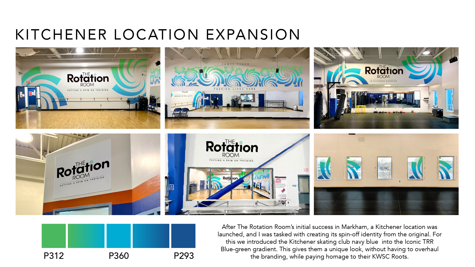
Kitchener Location Expansion Following The Rotation Room's initial success in Markham, a second location launched in Kitchener, requiring an adapted version of the original brand identity. To distinguish the new location while maintaining consistency, the Kitchener Skating Club's navy blue was introduced into The Rotation Room's signature blue-green gradient. This created a unique visual identity for the Kitchener location without requiring a complete redesign, while acknowledging its connection to the Kitchener-Waterloo Skating Club. The slide features photographs of the completed Kitchener facility, showcasing large-scale spiral murals, branded walls, signage and architectural graphics throughout the training space. The expanded colour palette incorporates Pantone 312, Pantone 360 and Pantone 293.
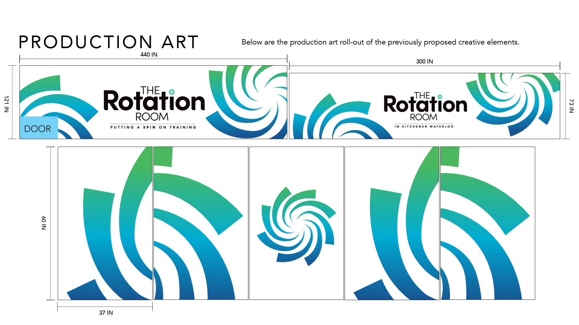
Production Art Production artwork developed for the rollout of The Rotation Room's Kitchener facility branding. The slide presents technical layouts and measurements for large-format wall graphics, including two horizontal branded wall installations and a multi-panel spiral mural. The designs combine the Rotation Room logo, location-specific messaging and oversized spiral graphics in the expanded blue-green-navy gradient. Detailed production dimensions demonstrate how the brand identity was translated into print-ready artwork for installation within the physical training environment.
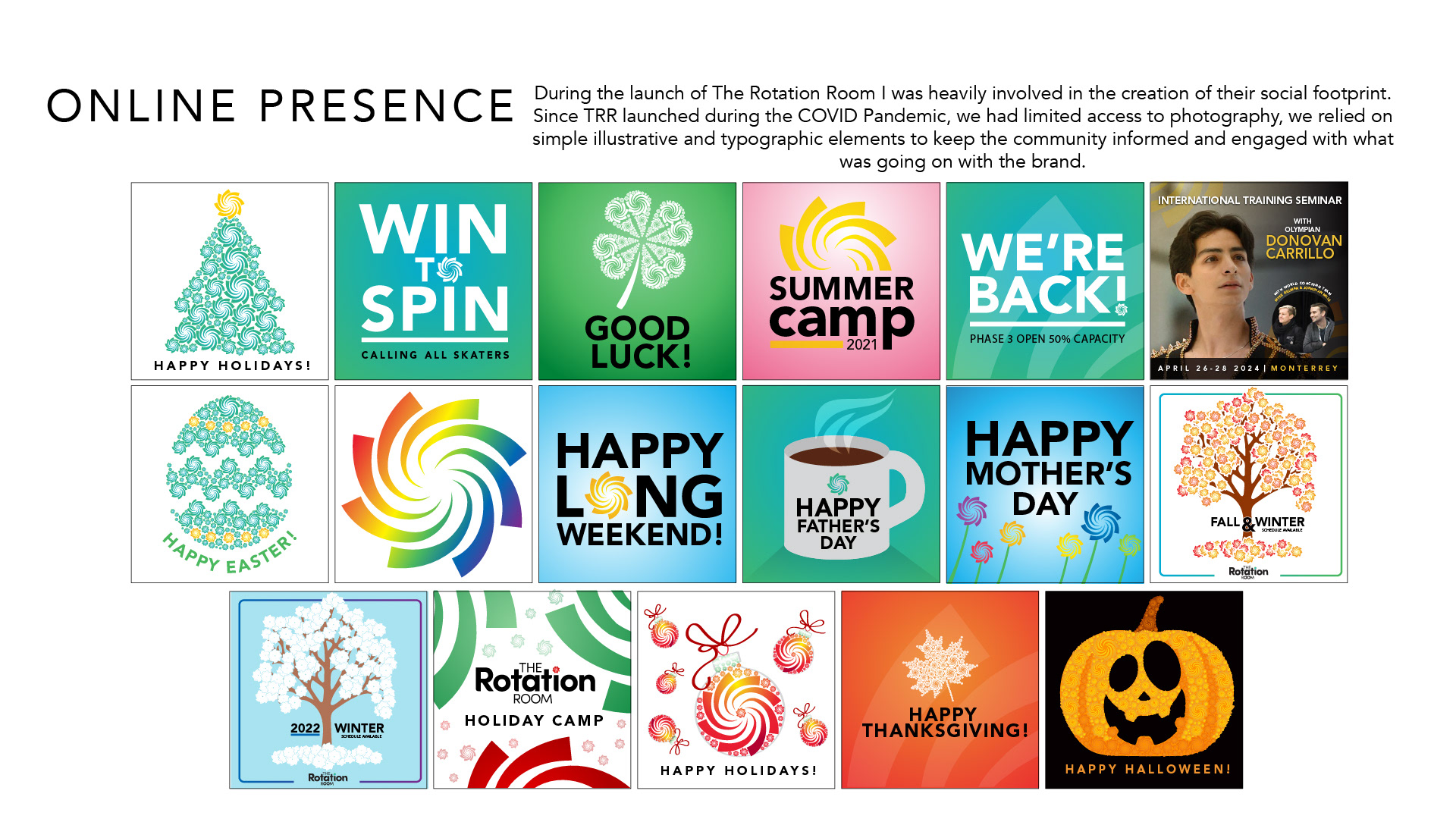
Online Presence During the launch of The Rotation Room, I was heavily involved in establishing the brand's social media presence. Because the business launched during the COVID-19 pandemic, access to photography was limited. Instead, the social content relied on simple illustrative and typographic elements to keep the skating community informed and engaged. The slide presents a collection of social media graphics developed for the brand, including seasonal greetings, holiday celebrations, training announcements, summer camps, reopening updates and international skating seminars. The creative uses bright colours, bold typography and playful illustrations built around the brand's signature spiral graphic. These executions demonstrate how the visual identity could expand beyond its minimal core system to support more expressive, community-focused communications while remaining recognizable.

You may also like

Planogram Mockups
2018
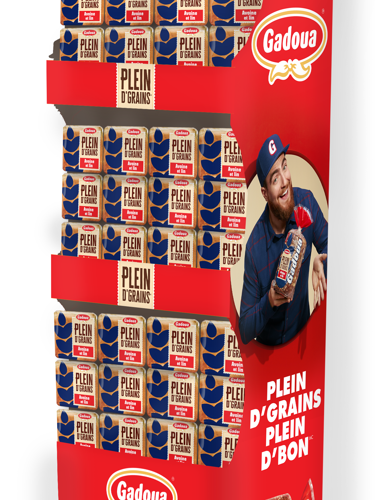
Gadoua Plein d'Grains POS
2019
Food Photography
2018
Holiday Corrugate Displays
2018
DeFranco Care Package
2018
Design Pitch Process - Save on Foods
2019
Weston Foods' Baked Goods Meets girl scouts Branding
2023
Read to Sell Sheets
2018
Indulgent Pies Packaging Design
2023
US Packaging Refresh
2018
↑Back to Top
Powered by Adobe Portfolio