Work
About
Contact
Work
About
Contact
Alasdair Hall

Back to School 2025 In Store Campaign

The creative development and ideation process for the Wonderbrands multi-branded 2025 Back to school campaign.

Wonderbrands — 2025 Back-to-School Campaign  Introduction to the 2025 Wonderbrands Back-to-School campaign, "Pack the Good Stuff," a multi-brand campaign promoting bread and tortilla products as part of everyday school lunches.  The slide features a bright red lunchbox on a wooden kitchen countertop, filled with sandwiches made from sliced bread, fresh vegetables and colourful fruit skewers.  The open lunchbox lid prominently displays the campaign headline, "Pack the Good Stuff," in bold, playful yellow and white typography.  A softly blurred kitchen background reinforces the everyday family setting, establishing a colourful, approachable visual identity for the campaign.
The Brief  Develop a multi-channel Back-to-School campaign featuring bread and tortilla products across Wonderbrands' portfolio.  The campaign was intended to support household penetration, strengthen the bread category and build upon the growth of tortillas.  The creative needed to accommodate multiple brands and regional markets, including Wonder, D'Italiano, Country Harvest and Casa Mendosa in English Canada, alongside Gadoua, D'Italiano, Country Harvest and Casa Mendosa in Quebec.  Three initial creative territories were identified: everyday back-to-school routines, packed lunches featuring sandwiches and wraps, and traditional back-to-school themes built around seasonal excitement and nostalgia.  Deliverables included point-of-sale materials, retail media, social media and presentation assets.  The slide features the campaign brief alongside a 2024 Wonder-branded retail display, providing context for the previous year's creative approach.
Past BTS Campaigns — 2019–2023  A retrospective of previous Wonderbrands Back-to-School campaigns, reviewing the visual approaches and retail executions developed between 2019 and 2023.  The slide presents six examples of promotional creative, including freestanding grocery displays, branded product towers, contest-driven promotions and seasonal advertising.  The examples feature colourful school-inspired graphics, sandwich photography, Wonder branding and promotional messaging such as "Get Ready for Sandwich Season" and "It Starts with Wonder."  The collection demonstrates the range of approaches previously used to connect bread products with the back-to-school season, establishing a foundation for identifying opportunities to evolve the campaign.
Design Process — Discovery, Define, Design, Deliver  An overview of the four-stage creative process used by Bakehaus for projects requiring strategic exploration and original design development.  The process begins with Discovery, researching the current state of the brand and its category. Define establishes the objectives, parameters and constraints for creative exploration. Design translates those insights into creative solutions, while Deliver focuses on executing the approved direction.  The framework is adaptable to the scope of each project, with iterative design and delivery cycles used when additional refinement is required.  The slide illustrates the four stages through overlapping red, yellow, blue and green circles, connected by curved arrows to communicate the iterative nature of the process.  Supporting descriptions explain the purpose of each stage and how the methodology helps guide creative decision-making.
An exploration of the shared attributes and differentiating characteristics of four Wonderbrands portfolio brands: Wonder, D'Italiano, Country Harvest and Casa Mendosa.  The objective was to identify common brand territories that could support a unified Back-to-School campaign without compromising the individual personalities of the participating brands.  Wonder is associated with softness, everyday comfort, familiarity and iconic Canadian branding. D'Italiano emphasizes indulgence, Italian inspiration and satisfying meals. Country Harvest focuses on grains, seeds, flavour variety and Canadian heritage, while Casa Mendosa brings authentic Mexican recipes, soft tortillas and versatility.  The slide uses an overlapping four-circle Venn diagram, with each brand positioned around the outside and shared attributes identified in the intersecting areas.  Common themes include everyday comfort, indulgence, bold design, Canadian identity, softness and colourful packaging.  This exercise helped establish the strategic foundation for a multi-brand campaign that could accommodate different product categories and consumer needs.
Discovery — Classic Back-to-School Retail Inspiration  A visual exploration of traditional Back-to-School retail merchandising and seasonal promotional displays.  The slide features a collage of grocery and retail installations incorporating recognizable school-related imagery, including pencils, crayons, notebooks, school buses, chalkboards and classroom-inspired signage.  Examples range from oversized pencil-shaped displays and school-bus-themed merchandising units to colourful product towers and freestanding promotional structures.  These references explore how familiar school imagery can be translated into attention-grabbing retail displays, helping identify potential visual directions for the campaign.
Discovery — Multi-Brand Retail Displays  An exploration of retail merchandising strategies designed to accommodate multiple brands and product categories within a single promotional display.  The slide presents a collection of grocery store installations, including Coca-Cola beverage displays, snack merchandising towers, mixed-product shelving systems and branded freestanding units.  The examples demonstrate how multiple products can be grouped under a shared promotional message while maintaining individual brand recognition.  This research informed the development of a Back-to-School campaign capable of bringing together bread, tortillas and other lunch-related products within a cohesive retail environment.
Discovery — Seasonal Retail Inspiration  A collection of retail window displays and in-store merchandising examples exploring how the Back-to-School season is represented outside the grocery category.  The slide features storefront installations using school supplies, backpacks, notebooks, chalkboard lettering, colourful props and oversized typography.  Several examples incorporate playful classroom-inspired environments, while others use more contemporary, graphic treatments to communicate the seasonal theme.  The research explores how retail environments create excitement around Back-to-School shopping and how similar visual strategies could be adapted to food merchandising.
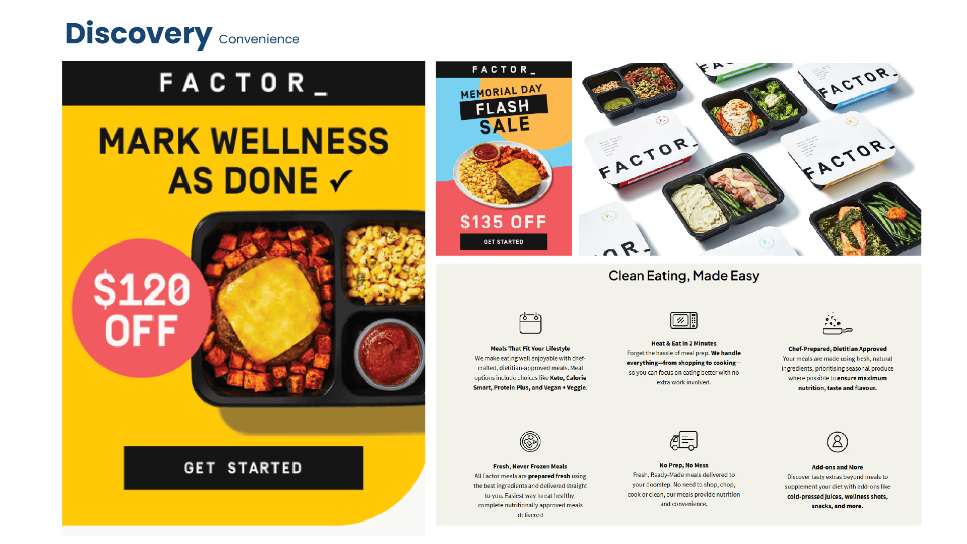
Discovery — Convenience and Meal Preparation  An exploration of convenience-focused marketing, using prepared meal brand Factor as a reference.  The slide features examples of Factor's advertising and digital communications, including bold promotional typography, prepared meal photography, subscription messaging and explanations of the service's convenience benefits.  The research investigates how brands communicate the value of reducing everyday planning and preparation.  For the Back-to-School campaign, this territory offered an opportunity to position Wonderbrands products as reliable, convenient solutions for parents preparing lunches throughout the school week.
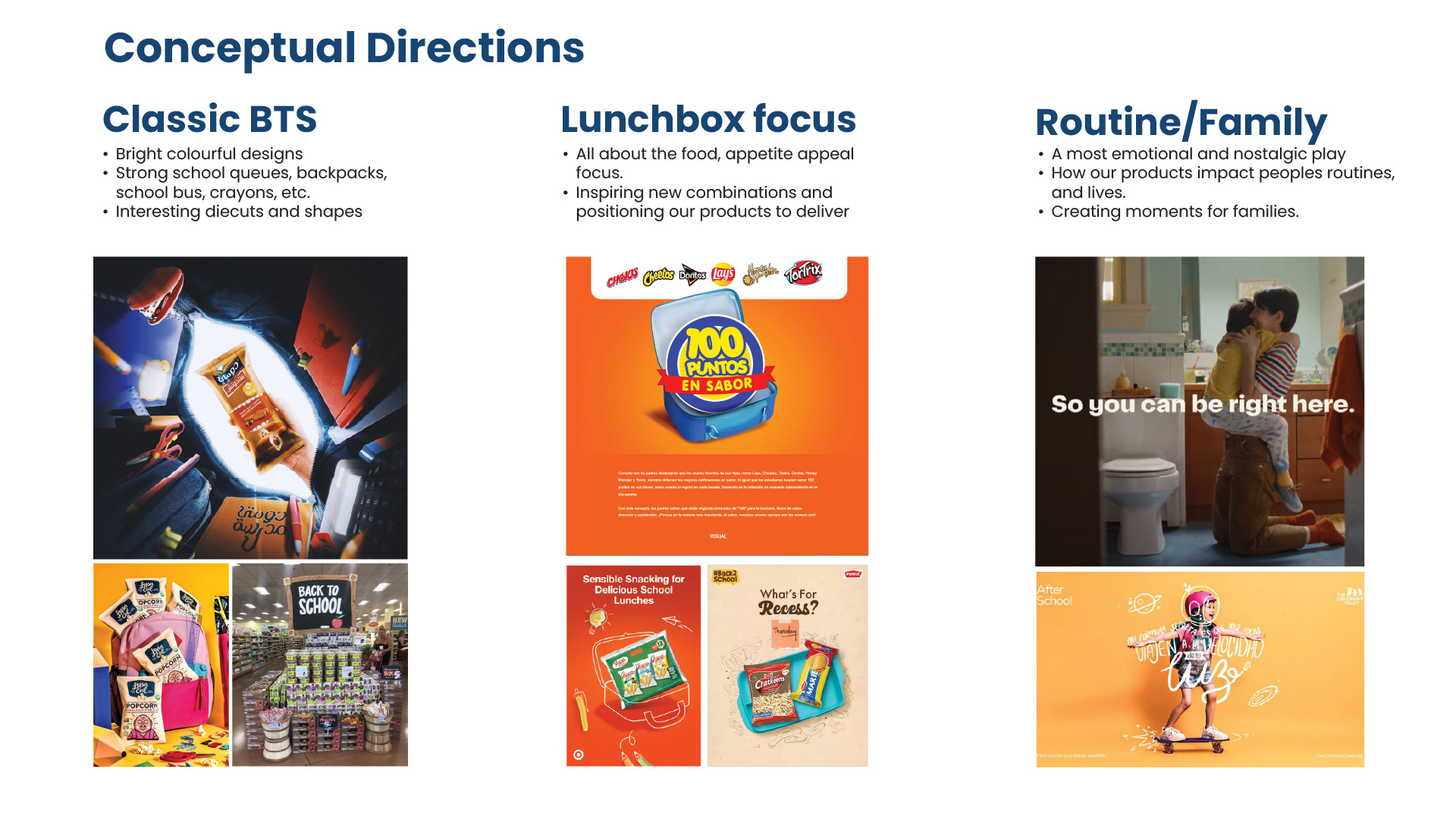
Conceptual Directions — Establishing Creative Territories  Following the discovery phase, three broad creative territories were identified for the Back-to-School campaign.  The first, Classic Back-to-School, focused on recognizable seasonal imagery such as school buses, backpacks, crayons and classroom supplies, using bright colours and playful retail display shapes.  The second, Lunchbox Focus, emphasized appetite appeal and the versatility of bread and tortillas, inspiring consumers with new combinations and creative lunch ideas.  The third, Routine and Family, explored the emotional connection between packed lunches and family life, emphasizing the role food plays in everyday routines and meaningful moments.  The slide presents three columns of visual inspiration, combining retail display examples, food advertising and lifestyle imagery to establish the creative possibilities within each territory.
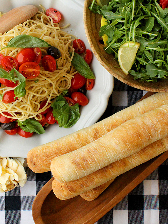
C1 — Back to School Basics  The first campaign concept explores a traditional Back-to-School direction, positioning Wonderbrands products as dependable staples for everyday school lunches.  The creative connects familiar school supplies with appetizing lunch photography, reinforcing the idea that bread and tortillas are convenient, reliable components of the school routine.  The design uses a bold blue background, oversized white typography reading "Back to School Basics," and colourful illustrations of pencils, crayons and paper clips.  Sandwiches, wraps and prepared lunch containers are incorporated throughout the layout to establish a direct connection between the seasonal theme and the participating brands.  The slide presents the concept applied to two point-of-sale formats: a square bookcase header and a tall stack side panel.  The result is a straightforward, recognizable seasonal campaign with strong retail visibility.
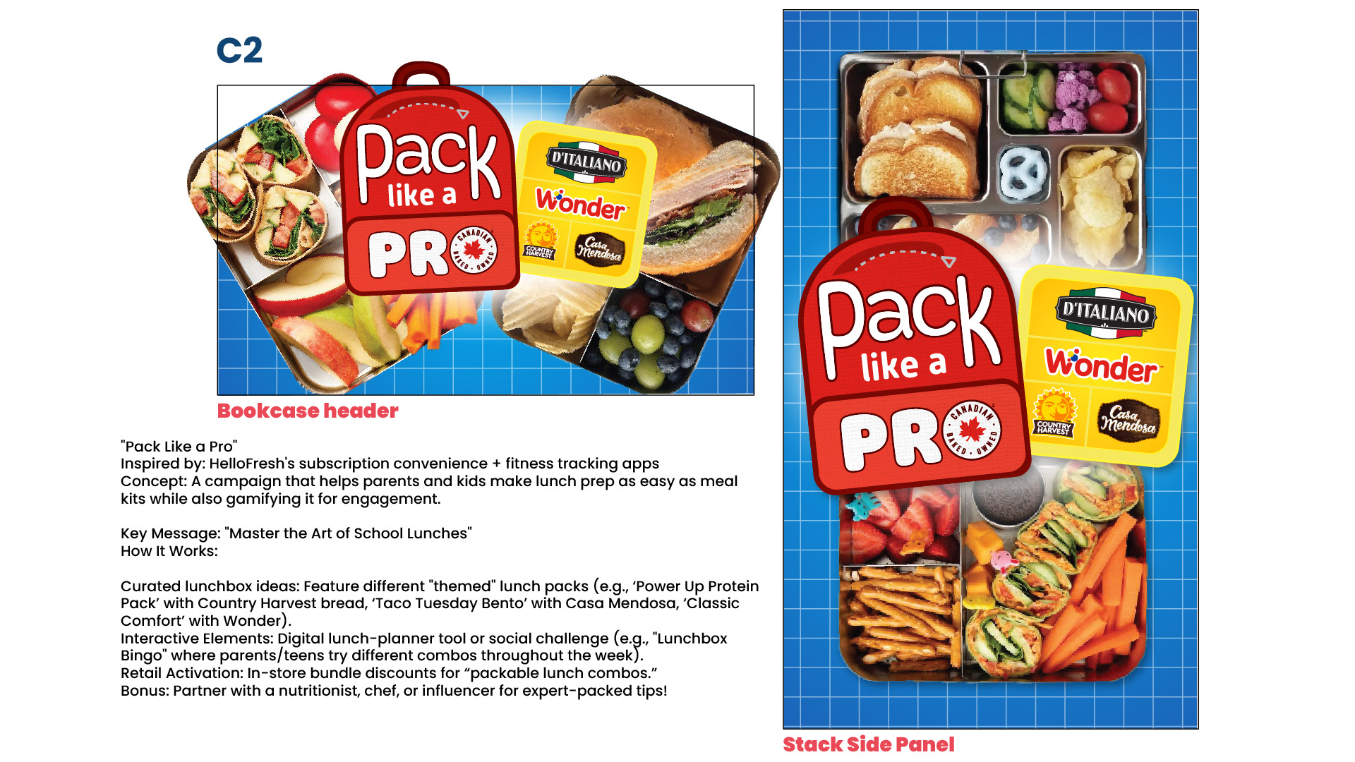
C2 — Pack Like a Pro  The second concept explores a more interactive approach to Back-to-School lunch preparation, positioning parents and children as experts in building creative, convenient packed lunches.  Inspired by meal-kit services and gamified digital experiences, the concept encourages consumers to experiment with different lunch combinations while simplifying the preparation process.  Potential campaign extensions included themed lunchbox recipes, digital lunch-planning tools, interactive social challenges and in-store meal bundles.  The creative features a bold red backpack-shaped graphic containing the headline "Pack Like a Pro," accompanied by the logos of Wonder, D'Italiano, Country Harvest and Casa Mendosa.  A bright blue grid background evokes classroom graph paper, while overhead food photography showcases sandwiches, wraps, fruit, vegetables and compartmentalized lunch containers.  The slide presents the concept across a square bookcase header and a vertical stack side panel, demonstrating its application to retail merchandising.
C3 — Pack with the Good Stuff  The third concept focuses on the appeal of a great school lunch, positioning Wonderbrands products as the foundation of meals children look forward to eating.  Inspired by the idea of lunchbox envy, the concept highlights the excitement of opening a lunch filled with appealing sandwiches, wraps and snacks.  The campaign encourages parents to make school lunches more enjoyable by choosing products that help create memorable meals.  The creative features a bright red lunchbox filled with wraps, carrot sticks and packaged snacks, set against a softly blurred school hallway background.  The headline "Pack with the Good Stuff" appears in large, playful yellow and white typography, supported by the logos of Wonder, D'Italiano, Country Harvest and Casa Mendosa.  The slide presents the concept as a square bookcase header and a tall stack side panel.  The colourful lunchbox serves as the central campaign asset, creating a recognizable visual that can be adapted across brands, products and retail formats.
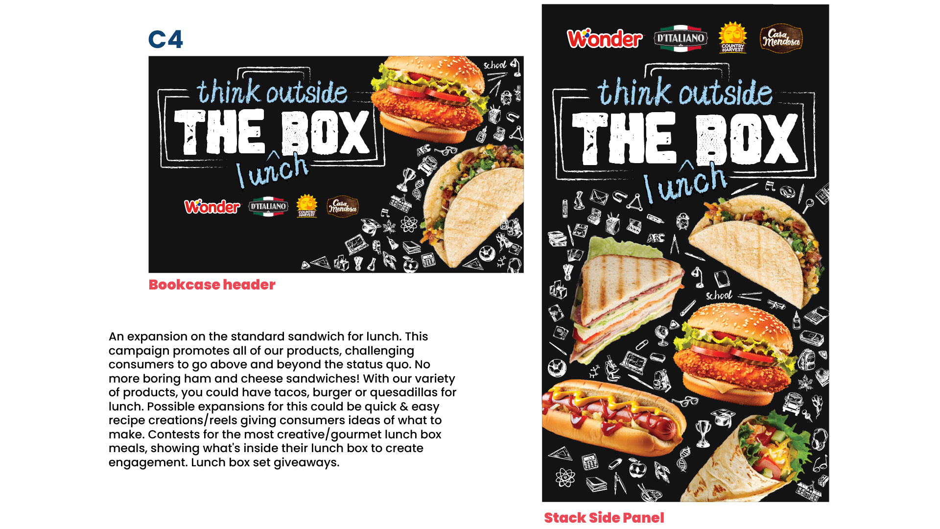
C4 — Think Outside the Lunchbox  The fourth concept encourages consumers to move beyond traditional sandwiches and explore the versatility of the Wonderbrands product portfolio.  The creative promotes a wider range of lunch possibilities, including wraps, tacos, quesadillas, burgers and other prepared meals.  Potential campaign extensions included recipe videos, creative lunchbox contests and consumer-generated content showcasing imaginative school lunches.  The visual direction draws inspiration from classroom chalkboards, using a black background, hand-drawn white illustrations and distressed typography.  The headline "Think Outside the Box" is paired with the handwritten word "Lunch," creating a playful connection between creativity and packed meals.  Large, appetizing food photography features burgers, tacos, grilled sandwiches, wraps and hot dogs, emphasizing the versatility of the participating brands.  The slide presents the concept across bookcase header and stack side panel formats.
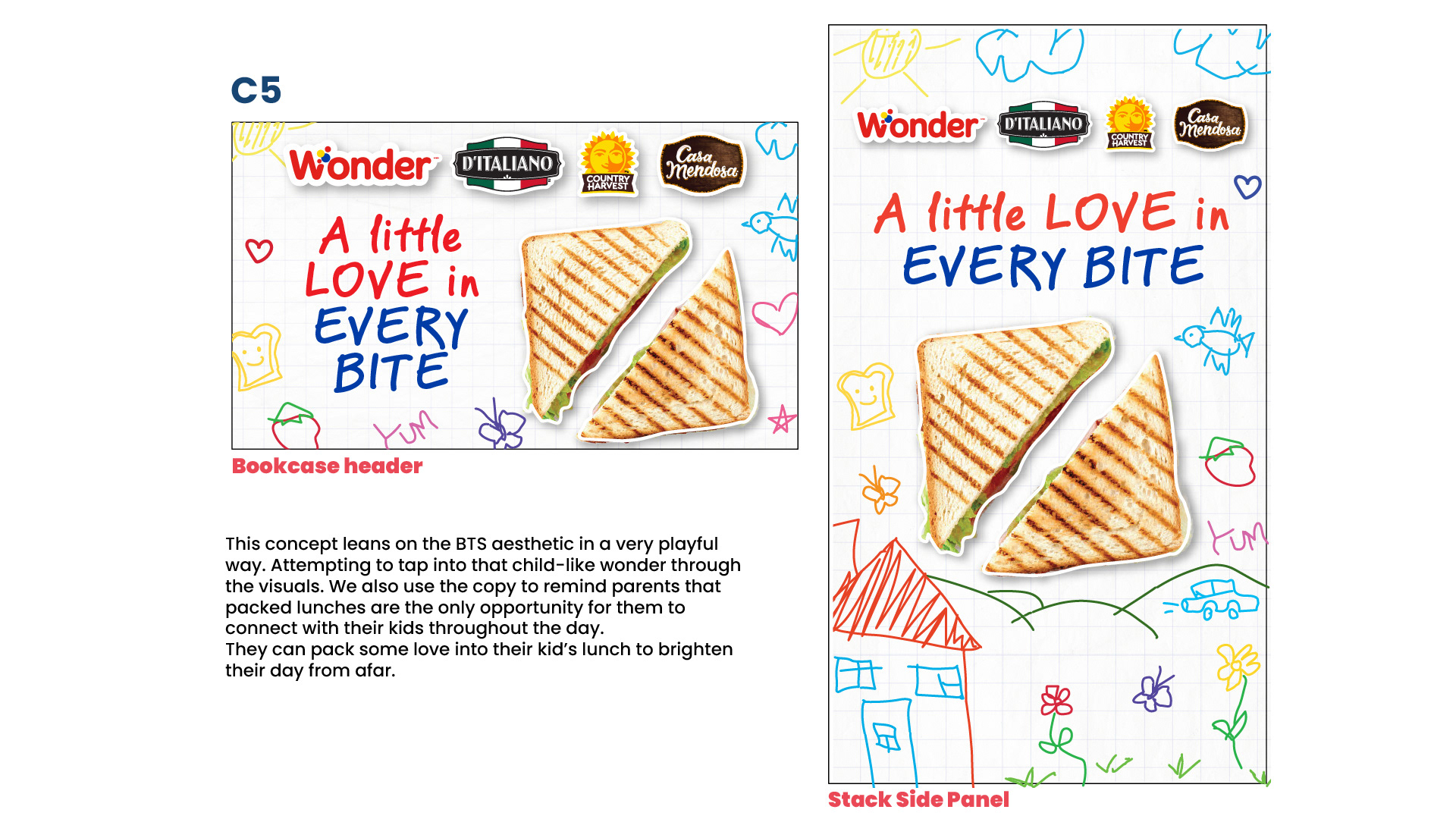
C5 — A Little Love in Every Bite  The fifth concept explores the emotional connection between parents and children through the everyday ritual of preparing school lunches.  The creative positions packed lunches as a way for parents to express care and affection during the school day, even when they cannot be physically present.  The visual identity embraces a playful, childlike aesthetic, featuring colourful hand-drawn illustrations of hearts, flowers, houses, animals and school-related doodles.  A black chalkboard-style background provides contrast for the brightly coloured graphics and the headline "A Little Love in Every Bite."  A large grilled sandwich, cut diagonally into two triangles, serves as the central food image.  The slide presents both a square bookcase header and a vertical stack side panel, supported by the logos of Wonder, D'Italiano, Country Harvest and Casa Mendosa.  The concept combines nostalgia, family emotion and food appeal to create a warmer, more personal Back-to-School message.
Concept Range — Creative Exploration  A side-by-side comparison of the five creative concepts developed for the 2025 Wonderbrands Back-to-School campaign.  Each concept is presented as a vertical retail stack side panel, allowing the creative directions to be evaluated in a consistent format.  The five directions include: - Back to School Basics: Traditional school imagery and convenient everyday lunches. - Pack Like a Pro: Interactive meal preparation and lunchbox creativity. - The Good Stuff: Appetizing school lunches built around recognizable Wonderbrands products. - Outside the Lunchbox: Creative alternatives to conventional packed lunches. - Love in Every Bite: An emotional approach connecting food preparation with family care. The slide highlights the range of visual strategies explored, from traditional seasonal messaging to playful, food-focused and emotionally driven campaigns.
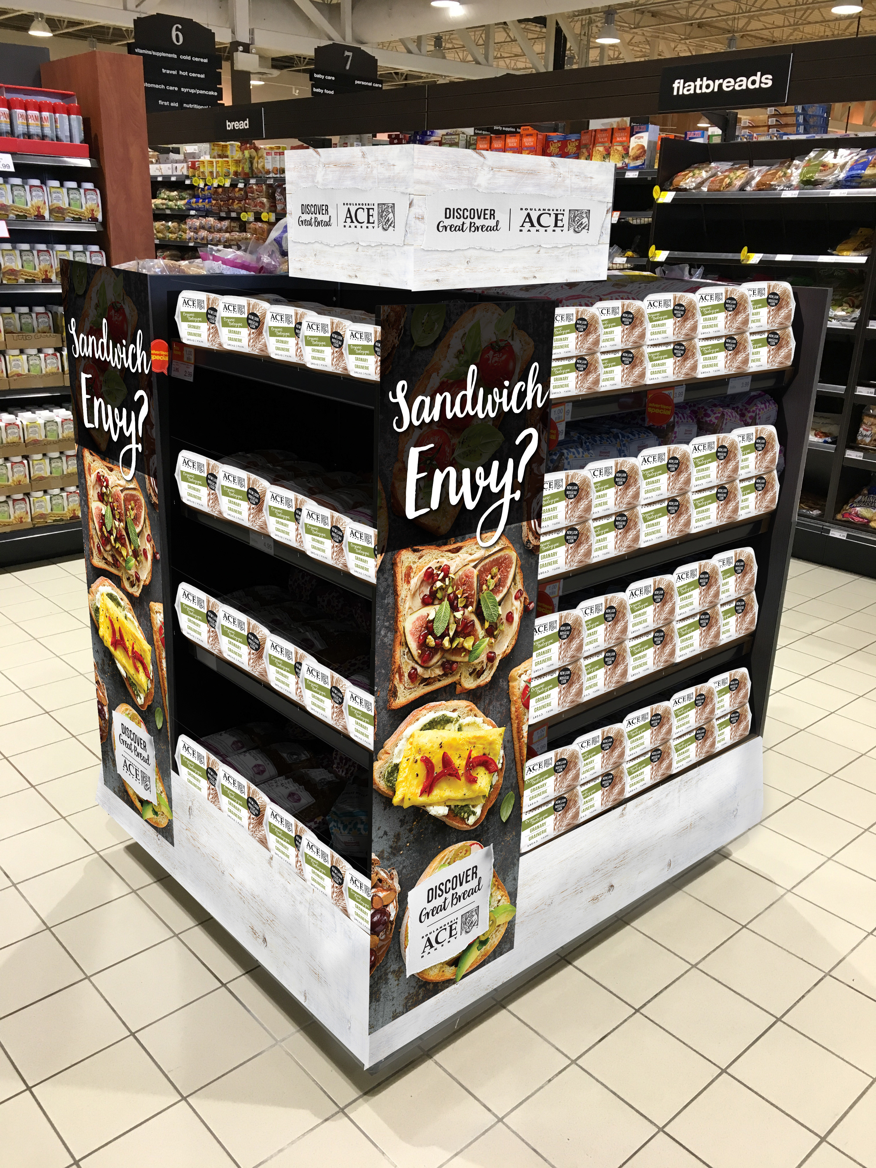
Recommendation — The Good Stuff  Following the creative exploration, "The Good Stuff" was selected as the recommended direction for the 2025 Back-to-School campaign.  The slide presents the five concept executions side by side, with the four unselected directions darkened to emphasize the recommended design.  The selected concept features a bright red lunchbox filled with wraps and snacks, playful yellow and white typography, and the participating Wonderbrands logos.  The recommendation establishes a strong visual platform built around lunchbox imagery, appetite appeal and a flexible multi-brand message.  The chosen direction provides a foundation for adapting the campaign across multiple products, regional markets and retail merchandising formats.
Approved Concept — Final Creative Development  Following the selection of "The Good Stuff," the campaign was refined into a series of approved creative executions.  The slide presents five variations of the campaign, each featuring an open, brightly coloured lunchbox filled with sandwiches, wraps, fruit, vegetables and other lunch items.  The primary English execution uses the headline "Pack the Good Stuff" on a red lunchbox, with additional variations featuring orange, yellow and green lunchboxes.  A French-language execution uses the headline "Emporte les bonnes choses," adapting the campaign for the Quebec market.  The compositions incorporate Wonderbrands products positioned beneath the lunchboxes, including Wonder, D'Italiano, Country Harvest and Casa Mendosa packaging.  The final creative system maintains a consistent visual identity while allowing flexibility in colour, product selection and language.
Final Assets — Food Photography and Visual System  A collection of final lunchbox assets developed for the approved Back-to-School campaign.  The slide features five brightly coloured lunchboxes in red, orange, yellow and green, each photographed with its lid open and filled with a different selection of lunch foods.  The largest red lunchbox contains sliced bread sandwiches, leafy greens, cucumber, pineapple and colourful fruit skewers.  The supporting variations feature wraps, sandwiches, vegetables, fruit and compartmentalized lunch arrangements.  Presented against a clean white background, the lunchboxes demonstrate the campaign's modular visual system and provide flexible assets for use across retail displays, advertising and digital communications.
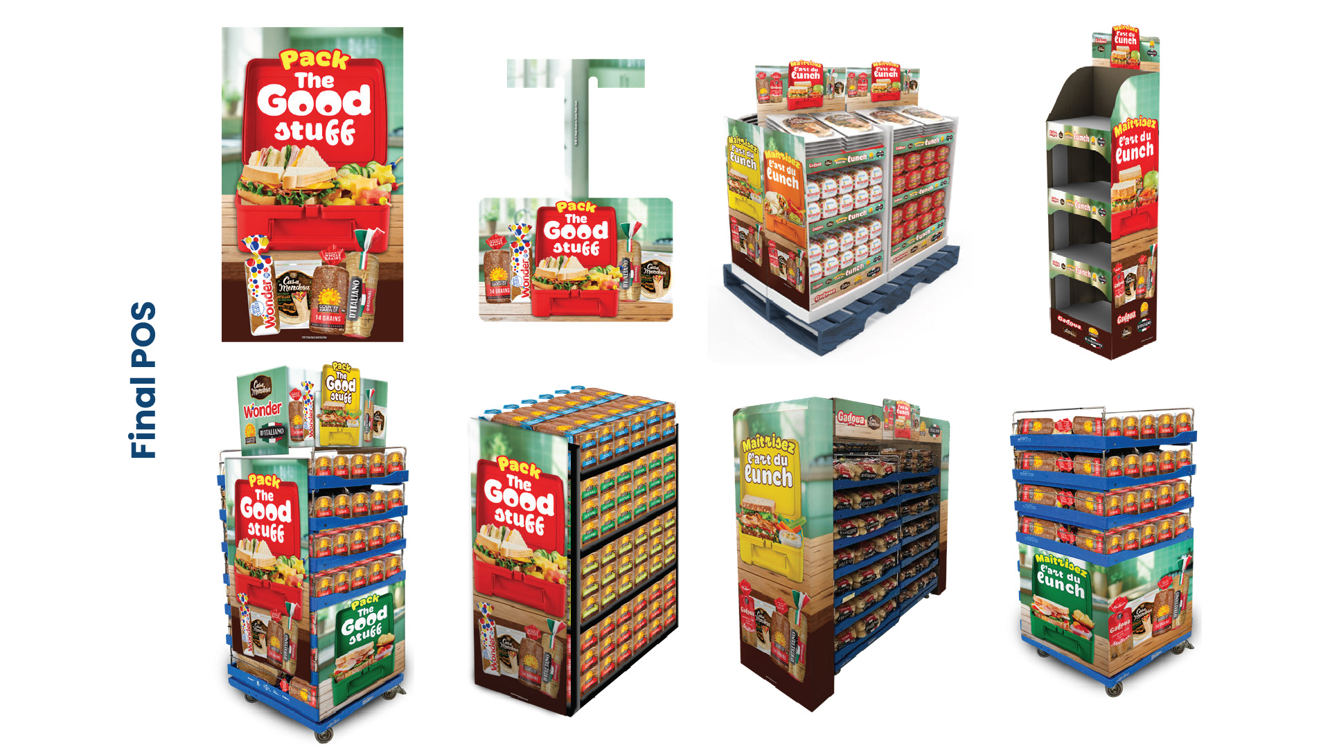
Final POS — Retail Campaign Rollout  The approved "Pack the Good Stuff" campaign was extended into a comprehensive range of point-of-sale materials designed for grocery retail environments.  The slide presents multiple merchandising applications, including vertical side panels, square display headers, freestanding product towers, pallet displays, shelving units and branded retail fixtures.  The designs incorporate the campaign's signature red lunchbox imagery, bold yellow and white typography, food photography and participating Wonderbrands product packaging.  Several executions adapt the campaign to different display structures and product configurations, demonstrating how the creative system can maintain a consistent visual presence across varied retail environments.  The collection showcases the translation of the campaign from a central creative concept into a coordinated suite of retail merchandising assets.

You may also like

Cafe Re-Brand
2018
Weston Foods NRA Booth
2018
DeFranco Care Package
2018
Food Photography
2018
Planogram Mockups
2018
Design Pitch Process - Save on Foods
2019
The Rotation Room Brand Identity
2026
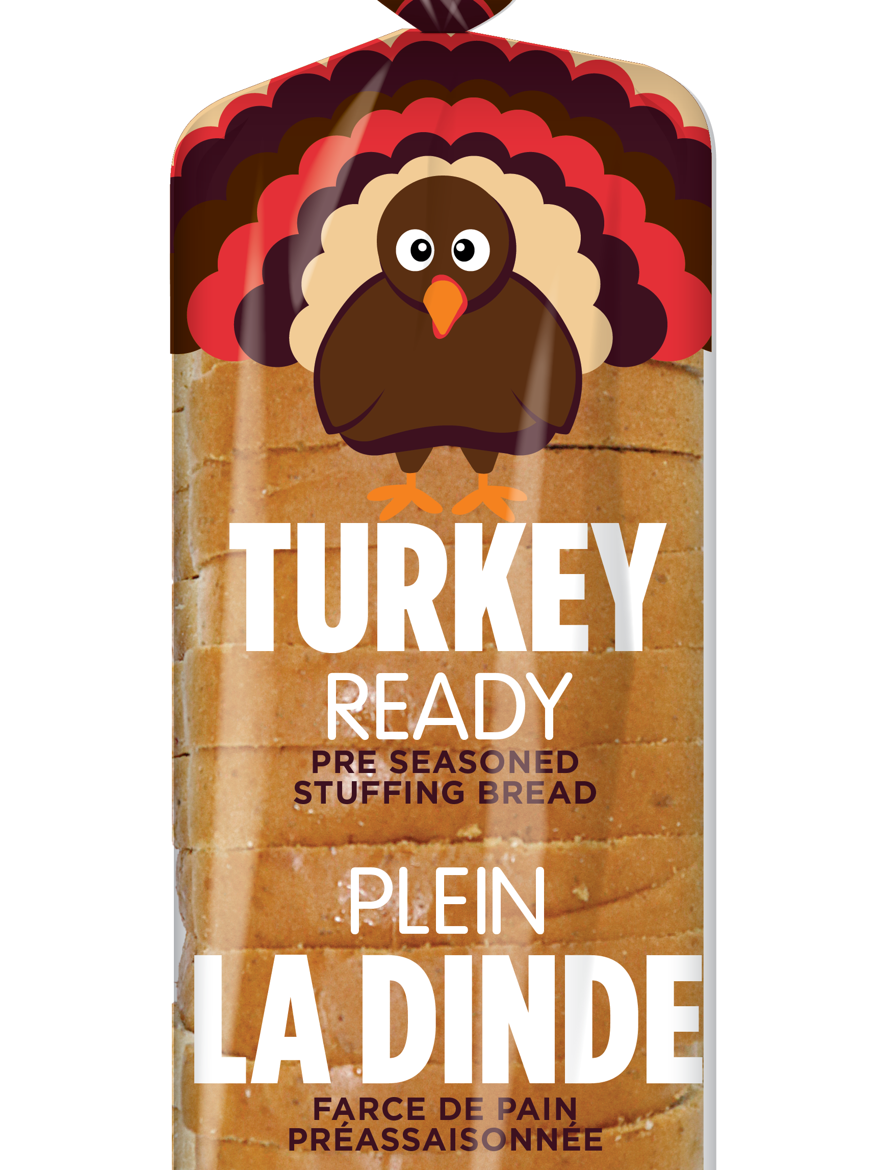
Turkey Ready - Packaging Design
2019
Strategic Design Pillars: Shared Creative Vocabulary
2023
Bold and Vibrant Tortilla Flavors for Casa Mendosa
2023
↑Back to Top
Powered by Adobe Portfolio