Casa Mendosa — Packaging Redesign Pitch  Opening slide introducing the Casa Mendosa packaging redesign project.  The slide features a close-up of the proposed Villa Mendosa visual identity, combining the recognizable Casa Mendosa script logo with a colourful illustration of a traditional Mexican-style house.  Warm terracotta and orange architectural shapes are framed by green cacti and foliage, while a bright turquoise brushstroke anchors the bottom of the composition.  The word "Original" appears in bold, hand-drawn lettering, with the product claim "Triple Baked Tortillas" positioned above it.  The composition establishes a colourful, illustrative visual direction inspired by Mexican architecture and traditional design elements.
The Brief — Building a More Distinctive Casa Mendosa  The objective was to grow brand awareness for Casa Mendosa and support growth within the tortilla category through a packaging refresh.  The existing packaging was considered too dark and lacked sufficient shelf visibility. The brief called for a more memorable and iconic visual identity, balancing Mexican authenticity with the versatility of tortilla products.  The creative exploration was to include three to five concepts, ranging from minor refinements to a complete redesign.  Key requirements included increasing product visibility, positioning important graphics within the lower half of the packaging for better visibility when displayed flat, and embracing colourful visual cues inspired by Mexican culture.  The slide features the existing Casa Mendosa tortilla packaging alongside reference examples from Que Pasa and Siete, illustrating the opportunity for a brighter, more distinctive visual identity.
The Discovery — Tortilla Category Packaging Analysis  An examination of competing tortilla brands revealed two dominant approaches to packaging design.  The first relies on appetite appeal, using photography of prepared wraps, tacos and ingredients to communicate product versatility and flavour.  The second emphasizes illustration and distinctive brand graphics to create differentiation on shelf.  The existing Casa Mendosa packaging attempted to combine both approaches without establishing a clear visual hierarchy, contributing to a somewhat disjointed appearance.  The slide features a collage of competitor packaging and in-store shelf photography, including Que Pasa, Dempster's, Unbun and other tortilla brands.  The research informed the creative decision to establish a stronger, more focused packaging strategy.
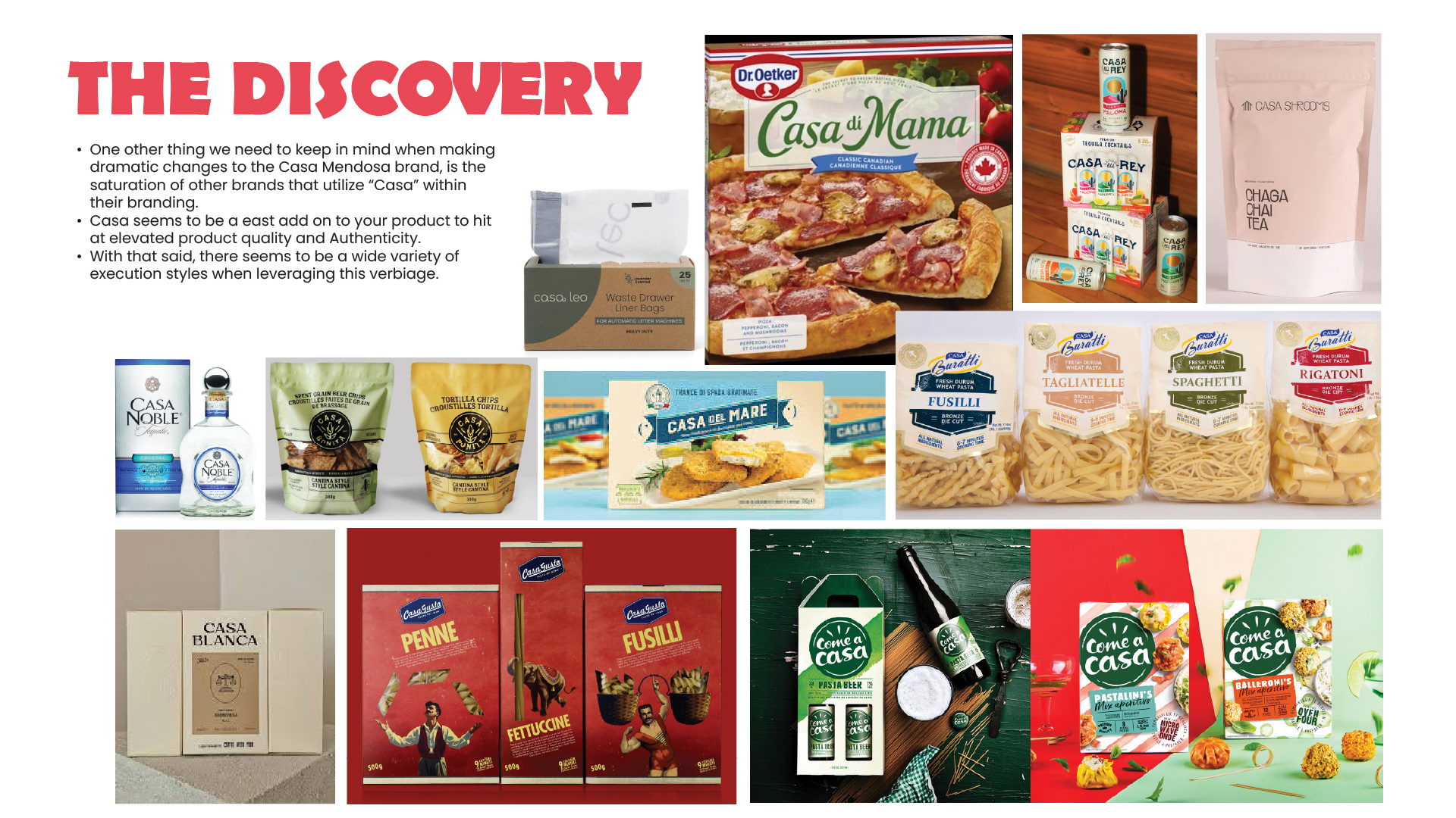
The Discovery — Differentiating Within the Casa Category  A secondary competitive analysis examined the widespread use of the word "Casa" across food and beverage branding.  The research identified numerous brands using the term to communicate ideas of tradition, authenticity and elevated product quality.  The slide features examples of packaging from categories including pasta, prepared foods, beverages and specialty grocery products.  The examples demonstrate a wide range of visual approaches, from restrained, premium packaging to bold, colourful and highly illustrated identities.  This analysis highlighted the importance of creating a distinctive Casa Mendosa identity that would remain recognizable within a crowded landscape of similarly named brands.
Define — Responding to Tia Rosa  The recent introduction of Bimbo's Tia Rosa tortilla brand into the Canadian market created an additional competitive consideration for the Casa Mendosa redesign.  Tia Rosa's packaging uses extensive colour coverage, bold black backgrounds and decorative illustrations featuring Mexican-inspired motifs such as cacti, guitars, leaves and bowls.  The designs also emphasize Mexican authenticity through prominent claims and the use of red, green and white.  The slide presents two Tia Rosa tortilla packages side by side: a green-and-black Yellow Corn variety and a yellow-and-black Flour Tortilla variety.  This research reinforced the need for Casa Mendosa to establish a distinctive visual territory rather than adopt the same graphic conventions as its emerging competitor.
Define — Improving Shelf Visibility and Wayfinding  An analysis of the existing Casa Mendosa packaging revealed that important product information was not sufficiently prominent when the bags were displayed horizontally on grocery shelves.  Although the SKU name was positioned within the visible display area, it lacked the visual emphasis necessary to stand out among competing products.  The slide compares a full Casa Mendosa Original tortilla package with photographs of the product in actual retail environments.  A red rectangular outline highlights the lower section of the packaging most visible to shoppers, while corresponding red callouts identify the limited shelf-facing area in the store photography.  This analysis established a key functional objective for the redesign: improve the visibility of product information and brand recognition within the portion of the packaging consumers actually see.
Current SKU Range — Existing Portfolio Architecture  An overview of the existing Casa Mendosa tortilla portfolio before the proposed redesign.  The slide presents nine product packages arranged in two rows, demonstrating the range of tortilla varieties, sizes and formulations offered under the brand.  Each package uses a similar visual structure, featuring a large dark wood-textured central label, the white Casa Mendosa script logo, product imagery and a decorative border.  Limited accent colours differentiate the individual products, while the predominantly dark packaging creates a consistent but visually repetitive shelf presence.  The comparison establishes the scale of the portfolio and the importance of developing a flexible design system capable of accommodating multiple SKUs.
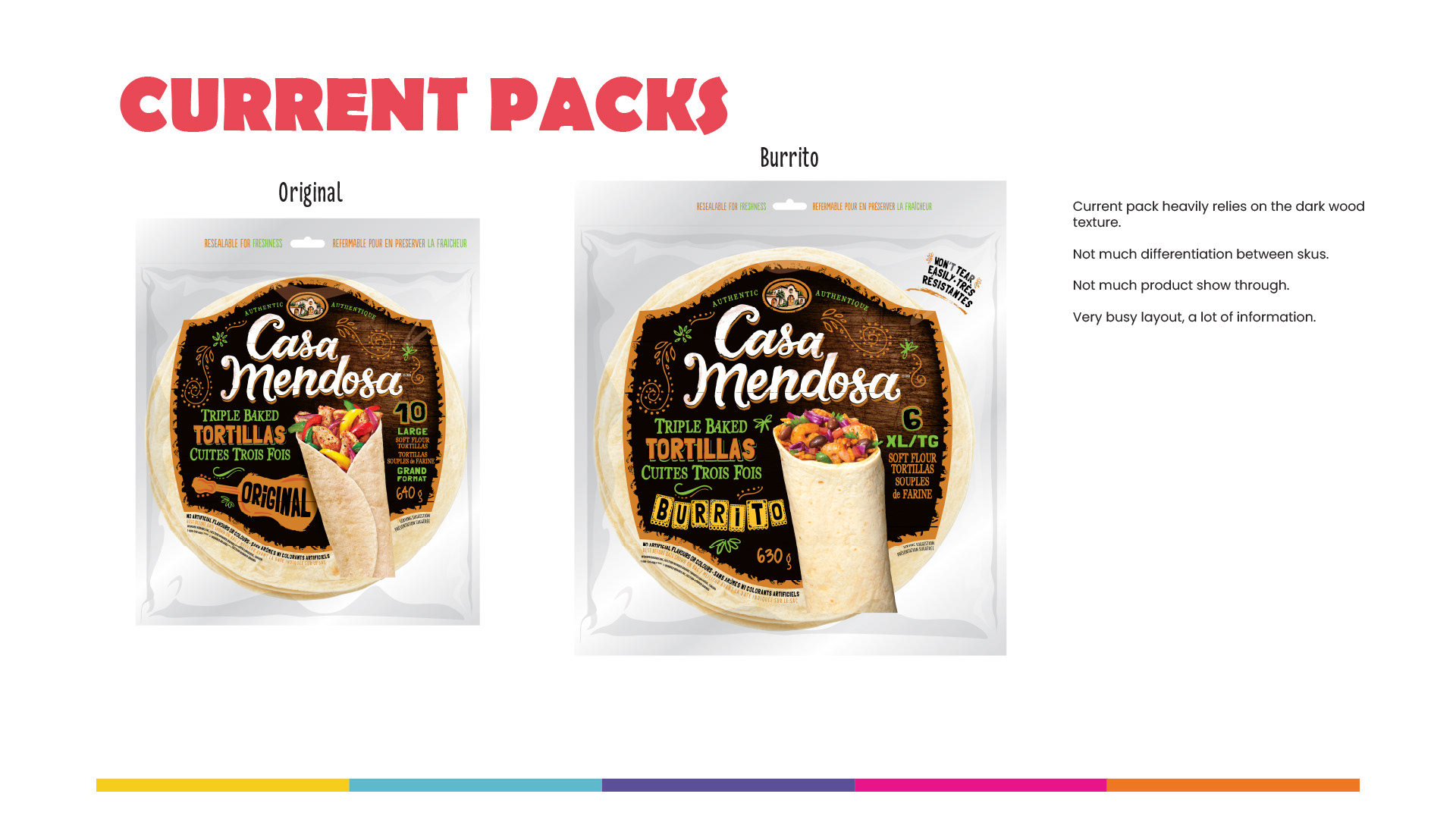
Current Packs — Identifying Design Weaknesses  A closer examination of the existing Casa Mendosa packaging, using the Original and Burrito tortilla varieties as representative examples.  The slide identifies four primary weaknesses in the current visual system: heavy reliance on dark wood textures, limited differentiation between SKUs, insufficient product visibility and an overly busy layout containing competing information.  The two packages feature large dark labels, ornate borders, multiple product claims and relatively small areas of visible tortillas.  The analysis highlights the opportunity to simplify the packaging architecture, improve product show-through and establish stronger visual hierarchy without sacrificing the brand's recognizable identity.
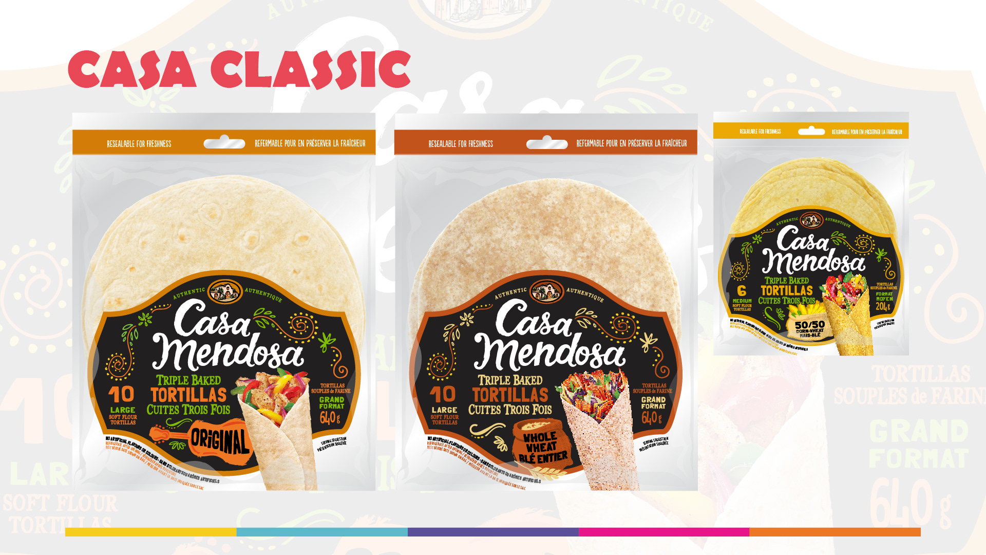
Casa Classic — Evolution of the Existing Identity  The first creative direction explores an evolutionary redesign that retains the recognizable elements of Casa Mendosa's existing packaging.  The concept preserves the dark, decorative label and signature Casa Mendosa script while simplifying the surrounding graphics and increasing the amount of visible tortilla product.  The label is repositioned toward the lower half of the package, addressing the shelf visibility concerns identified during the discovery phase.  A warm orange accent identifies the Original variety, while a darker brown-orange treatment distinguishes Whole Wheat.  The slide presents three packaging applications, including Original, Whole Wheat and a smaller-format tortilla product.  This direction offers a more conservative approach to modernization, improving the existing design without fundamentally changing the brand's visual identity.
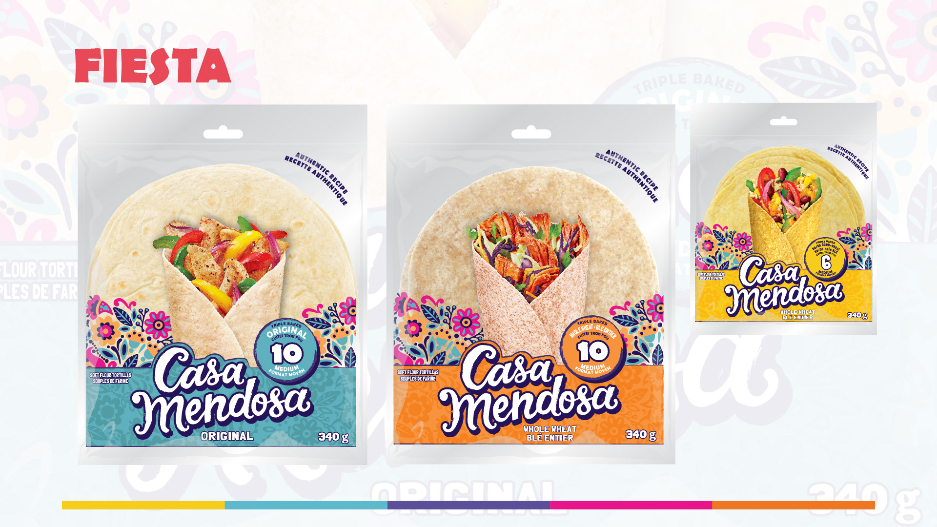
Fiesta — Colourful, Product-Forward Packaging  The second concept introduces a substantially brighter and more expressive direction for Casa Mendosa.  The design emphasizes product visibility by allowing the tortilla itself to occupy most of the packaging surface, with a triangular opening revealing a colourful prepared taco or wrap.  A vibrant illustrated floral pattern runs along the lower portion of the packaging, referencing Mexican decorative art and creating a recognizable brand asset.  The Casa Mendosa script logo is positioned prominently within this illustrated area, supported by a bold colour block that identifies each SKU.  Turquoise is used for Original, while orange identifies Whole Wheat.  The slide presents three packaging examples, including Original, Whole Wheat and a smaller 50/50 Corn-Wheat variety.  The result is a more playful, contemporary packaging system that balances Mexican-inspired illustration with strong product visibility and appetite appeal.
Fiesta-Halo — Framing the Product with Colour  The third concept builds upon the visual direction established in Fiesta, introducing a more prominent decorative framework around the tortillas.  Rather than concentrating the floral graphics exclusively at the bottom of the packaging, the design uses colourful Mexican-inspired illustrations to create a halo surrounding the visible tortilla.  The triangular opening continues to showcase prepared food imagery, while the Casa Mendosa script logo remains positioned near the bottom of the package.  Turquoise and orange colour blocks differentiate Original and Whole Wheat, with the illustrated halo creating additional visual interest and shelf presence.  The slide presents three package variations, including Original, Whole Wheat and a smaller Corn-Wheat variety.  This direction explores a more decorative approach to the same product-forward strategy, creating a stronger illustrated brand presence while retaining significant product visibility.
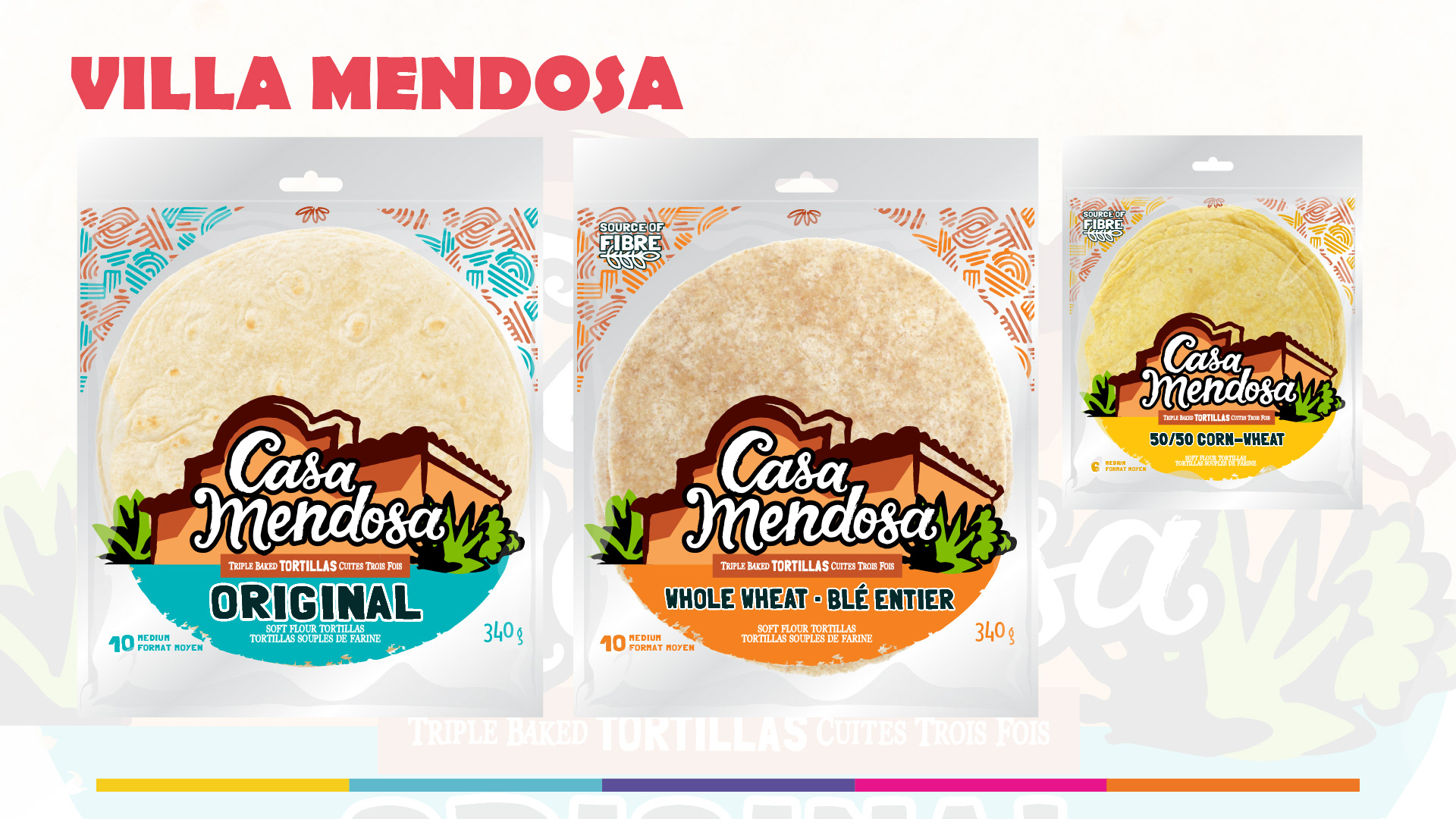
Villa Mendosa — An Illustrative Brand Identity  The fourth concept explores a more substantial reinvention of Casa Mendosa's visual identity.  The design introduces an illustrated Mexican-style house as the central brand element, creating a direct visual connection to the word "Casa."  Warm terracotta architecture, green cacti and stylized foliage frame the existing Casa Mendosa script logo, establishing a distinctive illustrated brand mark.  The majority of the package remains transparent, allowing the tortilla product to occupy a prominent portion of the design.  Bright turquoise and orange brushstroke graphics anchor the lower section of the packaging and provide clear SKU differentiation.  The slide presents three packaging applications, including Original, Whole Wheat and a smaller 50/50 Corn-Wheat variety.  This concept places greater emphasis on brand storytelling and illustration, using Mexican-inspired architectural imagery to create a recognizable visual identity across the product range.
The Range — Comparing Four Creative Directions  A side-by-side comparison of the four proposed Casa Mendosa packaging concepts.  Each direction is presented using the Original tortilla SKU to allow direct evaluation of visual hierarchy, product visibility, branding and overall shelf impact.  The four concepts include: - Casa Classic: An evolution of the existing dark-label identity with improved product visibility. - Fiesta: A colourful, product-forward design featuring illustrated floral graphics and a prominent prepared-food image. - Fiesta-Halo: A more decorative variation of Fiesta, using a floral halo to frame the tortilla. - Villa Mendosa: A distinctive illustrated identity featuring Mexican-style architecture and bold SKU colour coding. The slide uses a black background to isolate the packaging concepts and facilitate visual comparison.  The four directions demonstrate a progression from conservative brand evolution to a more comprehensive identity redesign.
Recommendation — Fiesta  Following the creative exploration, Fiesta was selected as the recommended direction for the Casa Mendosa packaging redesign.  The slide presents all four concepts side by side, with Casa Classic, Fiesta-Halo and Villa Mendosa darkened to emphasize the selected Fiesta design.  The recommended concept combines a large transparent product window, colourful Mexican-inspired illustrations, a prominent Casa Mendosa logo and a clear system of SKU differentiation.  The triangular prepared-food image adds appetite appeal while reinforcing the versatility of tortilla products.  The direction addresses the primary challenges identified in the brief: improving shelf visibility, creating a more memorable visual identity and balancing Mexican authenticity with contemporary packaging design.

You may also like

↑Back to Top