Work
About
Contact
Work
About
Contact
Alasdair Hall

Mie et Cie Brand Creation

The creation of a new Quebec-first bread brand and packaging.

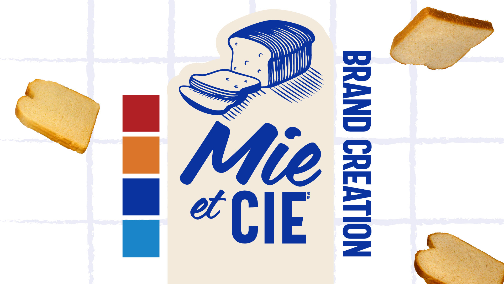
Introduction to the Mie et Cie brand creation project, featuring a new premium bread brand developed exclusively for the Quebec market.  The slide showcases the finished Mie et Cie logo, combining expressive blue script lettering with bold typography and a traditional woodcut-style illustration of a sliced bread loaf.  The visual identity is supported by a warm cream background, subtle grid pattern, floating bread slices and a four-colour palette of red, orange, royal blue and light blue
Launch a new premium bread brand exclusively for the Quebec market.  Quebec consumers have a strong preference for supporting local businesses. The objective was to build on that preference by creating a locally baked bread brand made with high-quality Quebec ingredients, positioned to compete with established local brands such as St-Méthode Bakery.  The project was originally briefed under the name Notre Maison, meaning "Our House," before eventually evolving into Mie et Cie, a French play on words roughly translating to "Crumb and Company."  An additional challenge was the extremely tight timeline: initial brand concepts were due the following morning.  The slide features a packaged bread loaf with a question mark representing the yet-to-be-developed brand identity, surrounded by floating slices of bread.
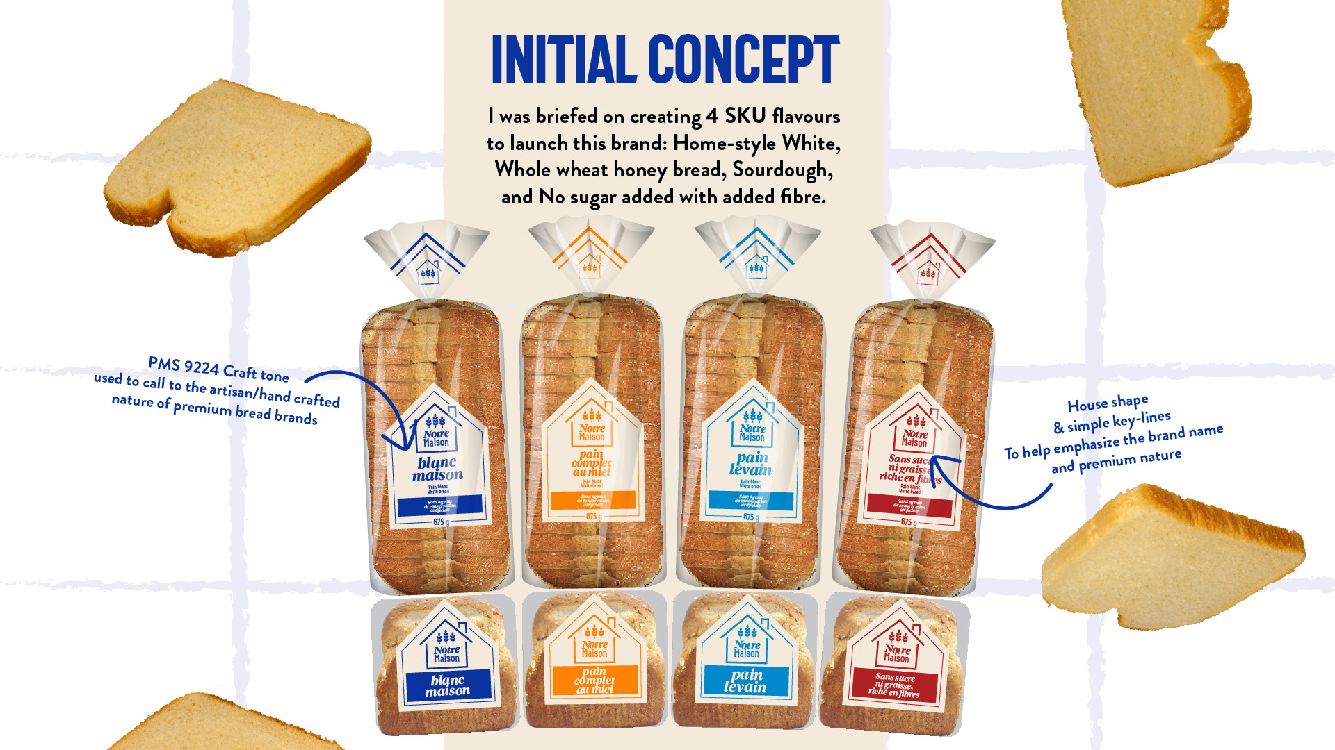
Initial Concept  The initial brief called for a packaging identity across four bread varieties: Homestyle White, Whole Wheat Honey, Sourdough, and No Sugar Added with Added Fibre.  Working under the original brand name Notre Maison, the first concept explored a house-shaped label to reinforce the name and establish a sense of warmth, familiarity and local craftsmanship.  Simple geometric keylines and wheat illustrations were used to create a premium, traditional bakery aesthetic. A warm craft-paper tone, Pantone 9224, was incorporated to emphasize the artisanal and handcrafted positioning of the brand.  The slide presents four packaging concepts with coordinated front labels and bag closures, using blue, orange, light blue and red to distinguish the individual SKUs.  Each design retains substantial product visibility through transparent packaging, allowing the bread itself to remain a prominent part of the presentation.
The project began before full alignment had been established with the Quebec team. Once feedback was received, it became clear that the original name, Notre Maison, would not resonate as intended with the target audience.  The brand underwent a significant change, adopting the new name Mie et Cie, a French pun roughly translating to "Crumb and Company."  This change also challenged the relevance of the original house-shaped identity. With the brand name no longer connected to the idea of a home, I recommended moving away from the house graphic and reconsidering the visual direction.  Despite the limited time remaining, I returned to the drawing board to develop a new series of design explorations that could help leadership quickly evaluate different directions.  The slide illustrates this transition with the original Notre Maison logo crossed out and an arrow pointing toward an interim Mie et Cie logo, still contained within the original house-shaped graphic.
Following the brand name change, I developed four distinct packaging directions for Mie et Cie, each exploring a different visual personality while maintaining the core requirements of the brief.  The objective was to present leadership with meaningful creative alternatives that would help focus the conversation and establish alignment within the project's compressed timeline.  The four concepts included: - Ticket-inspired label: An evolution of the original house shape into an angular hanging tag, preserving the simple keylines and geometric structure. - Crumb-shaped label: A playful, irregular label inspired by the shape of a bread crumb, paired with expressive typography. - Banded branding: A horizontal paper band wrapped around the loaf, referencing traditional bakery packaging. - Woodcut illustration: A more heritage-inspired approach featuring a traditional bread illustration and bold typography, drawing inspiration from ACE Bakery. The slide displays all four concepts applied to full bread packages, with accompanying views of the front labels.  Together, the concepts demonstrate a range of potential brand personalities, from clean and contemporary to playful, traditional and artisanal.
Final Selection  Following the exploration phase, the leadership team selected the concept featuring traditional banded branding and a woodcut-style bread illustration.  The decision was influenced by the recent success of ACE Bakery's Classic Half-Bistro loaves, another packaging project developed by my team.  The selected identity combines expressive blue typography, a traditional bread illustration and a structured vertical label system, creating strong shelf visibility and a recognizable brand presence.  The product naming was also refined, moving away from generic bread descriptions toward names with greater personality.  The final portfolio includes four varieties: - L'Essentiel: White Bread, identified by red packaging accents. - Le Délicat: Honey and Whole Wheat Bread, identified by orange accents. - Le Levain: Sourdough Bread, identified by royal blue accents. - L'Équilibré: Bread with no added sugar or fat and added fibre, identified by light blue accents. The slide presents all four final packaging designs, showing both full-loaf bags and their corresponding end-label treatments.  Consistent logo placement, illustration, typography and packaging architecture create a unified brand system, while individual SKU colours allow consumers to distinguish varieties at a glance.
In-Store  Alongside the launch of the Mie et Cie brand and packaging, we developed in-store merchandising displays to establish a strong retail presence and help consumers discover the new products.  The slide presents four freestanding display concepts designed to showcase the bread range in grocery environments.  Two taller displays use blue shelving and large branded header panels, while two smaller displays feature stacked product arrangements with integrated signage.  The displays incorporate the Mie et Cie logo, product photography and the brand's blue-and-cream colour palette.  The messaging includes the bilingual brand statement "Simply good. Simply us." and "Simplement bon. Simplement nous."  These applications extend the identity beyond individual packaging, creating a cohesive visual presence at the point of purchase.

You may also like

Indulgent Pies Packaging Design
2023
MLSE Out of Home Creative
2019
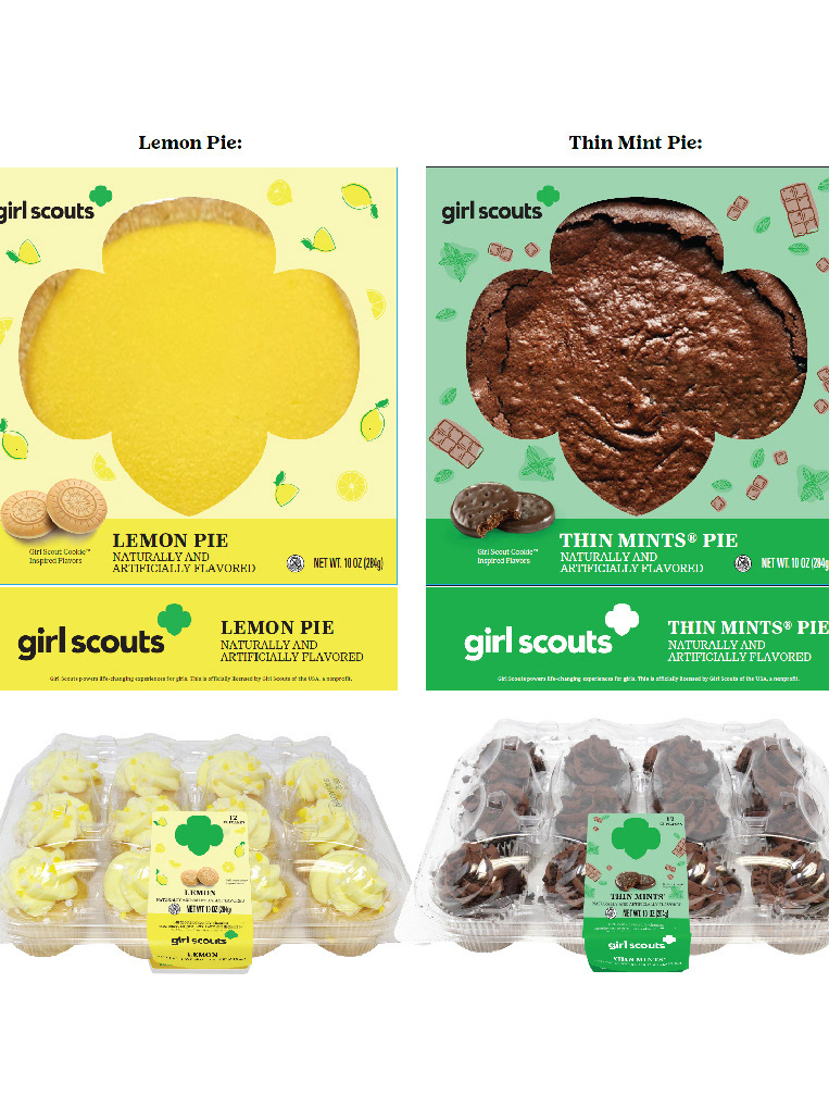
Weston Foods' Baked Goods Meets girl scouts Branding
2023
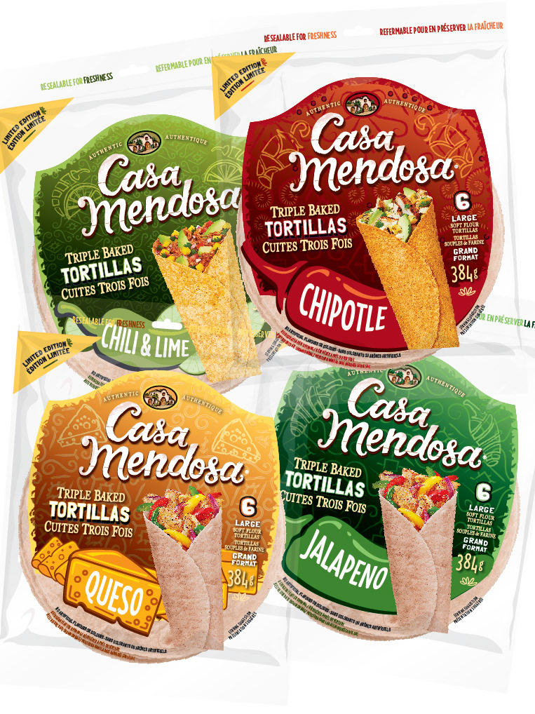
Bold and Vibrant Tortilla Flavors for Casa Mendosa
2023
Wonder Wayfinding
2026
Planogram Mockups
2018
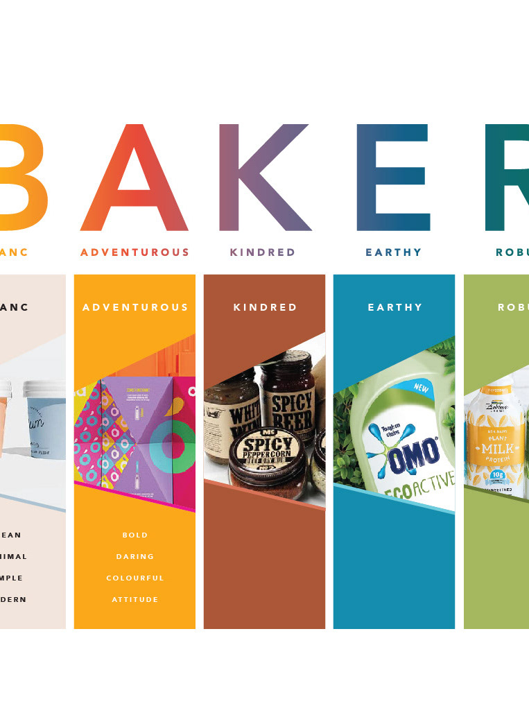
Strategic Design Pillars: Shared Creative Vocabulary
2023
Universal Partnership / Wonder, D'Italiano, Gadoua
2019
Weston Foods NRA Booth
2018
Food Photography
2018
↑Back to Top
Powered by Adobe Portfolio